We are multi-cultural travelers. Did you know? Throughout our journeys, country to country and city to city, we are consistently coming in contact with designed artifacts that reflect and build cultures. Imagery and graphics play a big part in defining how a city or region is perceived culturally, but it’s the inclusion of type and its use that help codify the local way of life from place to place. Culture is not a function of distance—simply traveling from one town to the next can yield small differences in the way things like signage, billboards, and other collateral pieces are presented. The greater the distance, however, the larger the impact those cultural changes seem to be. Yet, at the center of it all, remains typography. It is the catalyst in our cultural cyclotron.
As designers, we are trained to recognize the subtle differences in type use and application. Yet we often become blinded, perhaps desensitized, to the type around us as well as those cultural shifts that occur as we move from place to place. Not the case with designer Nikki Villagomez. Over the past eight years, Nikki has honed her typographic eye by studying and examining type use as it relates to different geographic environments. Through her travels, she has visually cataloged ghost signs, business signage, murals, graffiti, and other type-related artifacts in the public space—the results of which are then channeled into powerful observations about type on her fantastically rich blog. Nikki then took this deep well of accumulated knowledge and published her 2015 book, Culture+Typography: How Culture Affects Typography, where she explores the impact of how factors like time, population, etc. affect type use in a region—and vice versa. She has since “polymathed” (yes, I know) her knowledge into a series of talks that she has delivered at various industry events.
Nikki will be joining the Portland AIGA chapter on Tuesday, October 2 to speak about what type use in our fair city reveals about our local culture. Nikki took some time out of her busy schedule to talk with us a bit about what type style, cultural influence, and the differences in locale can teach us about typographic application
Typography is just one small aspect of the larger field of design. Why do you think you’ve gravitated so strongly toward type, its use, and cultural significance?
I can trace it back to 2004. I founded and was president of the South Carolina chapter of AIGA. Our chapter had a ton of fantastic speakers that we hosted, but there was one event that had the most impact for me. I had made friends with the president of the Honolulu chapter at a leadership retreat right before launching AIGA SC and talked her into doing a “Culture Exchange” for our upcoming December event. We boxed up things that were specific to South Carolina in addition to projects designed for SC clients by SC designers. The Honolulu chapter did the same. We mailed the boxes to each other and on the day of the event, the packages were opened. I was blown away by how much their culture affects their design and typography choices. It forced me to look at design in a completely different way. Font selection, color usage, and other design choices inspired by the visual language of their cultural surroundings were inspiring and revealing.
The following year we worked with the Las Vegas chapter on another exchange. Once again, I couldn’t help but notice the completely different styles of design reflective this time of the Vegas vibe. I’ve been very aware when I travel to really observe the design around me and how culture has played a part in the end result. I started my blog to document my findings and to create a space for my love of typography. My end goal is to bring awareness to typography and how culture plays a part in the choices that are made.
Type is a very graphic medium, why do you think type has become such a strong, representative graphic artifact for defining local culture?
Because it’s how we communicate! The way the typography is displayed in a city says a lot about the local culture. Some cities don’t have the financial means to fund large flashy signs, so they rely on hand lettering. Some places invest heavily in their typographic landscape, so much so that the history is lost in the process. Other cities do an excellent job at celebrating their history, restoring old signs, and renovating buildings while holding on to their past in the process.
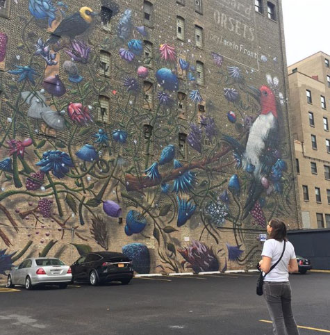
Hand lettering spotted in Atlanta, Georgia
Along those same lines, what can type teach us about a particular culture?
Type can teach us a great deal about a culture by the fonts that are chosen and the technique used in setting the words, but it’s not just the typography that is insightful—it’s the medium used (hand lettering, neon, plastic letters, etc.). All of the aspects that go into the making of the sign are relevant and offer a glimpse into the history; you just have to look for it. For example, I discovered a lot of ghost signs while walking around Detroit, Pittsburgh and Grand Rapids. In Philadelphia and Charleston, SC, the history of the city is very prevalent. In Albuquerque, the jeweled colors in their typographic landscape are very different than what I see here in Charlotte.
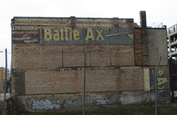
Ghost sign photo taken in Grand Rapids, Michigan
You talked earlier about the value of the “culture exchange”, what did you take away from that process and how did it change how you look at type and typography?
That event left such an impression on me, I kept it in the back of my mind. Yet, it wasn’t until several years later, when I became an in-house designer, that I acted on it and created my blog. I needed a way to keep my love of typography alive and my blog with the idea of the culture exchange was the perfect fit. I started my blog highlighting how culture affects typography as a passion project and haven’t looked back. This whole process has made me hyper-aware everywhere I go to really take in my surroundings. I don’t take for granted the amazing cities I have been able to visit, it has been such a wonderful way to travel the country and meet other creatives along the way that I have stayed in touch with.
Culture + Typography website
You’ve compared culture that lives in a city to “a virus that is trying to stay alive.” Can you elaborate on that idea a bit more?
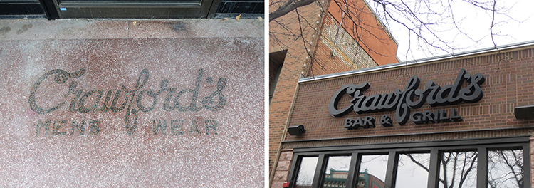
In that statement, I mean “virus” in the best possible way. When a business moves into a space, there are opportunities to rebrand both the interior and exterior. A lot of times, the old business guts the space to create an environment unique to their brand. Sometimes, the new business will incorporate the old signs into the new branding. This is an example of a virus trying to stay alive. Using the history as part of the present…and then the future. The best example I have encountered of this is Crawford’s in Sioux Falls, South Dakota. Crawford’s Mens Wear logo is on the floor at the entrance. Crawford’s Bar & Brill moved in and used the old logo to inspire their new logo.
There is a chapter in your book in which you talk about cultural observations and how your impressions / ideas of a city that you are traveling to don’t always match up with the photos that are sent ahead by locals for your presentations?
For those of us who are born and raised in a city, or if we have lived in the same city for several years, we become immune to our surroundings that make our city unique. The areas that draw people to a city are deemed a “tourist trap” and the last place a local will want to be. I have found this to be true with my speaking engagements. I learned in San Antonio that the locals don’t identify with The Alamo. In Orlando, the locals don’t reference Disney as something that makes their city unique. It’s where tourists go. This has been a big revelation for me and a very eye-opening discovery.
I think one of the most impressive things that came out of my initial research heading into this interview was to see just how long you’ve been working on your blog. That’s rare. How have you stayed motivated over the past seven years to keep contributions to your blog regular?
It’s truly a passion of mine. With all the traveling I do, I have been able to keep it fresh by adding new pictures to the mix. Honestly, it’s very therapeutic for me and has never once felt like a chore or a hassle. I love putting posts together.
Many designers start creative projects on the side as a way to provide balance between client work and their own personal, creative needs. Is that why did you decided to start a blog?
I am the Director of the Creative Studio for Dixon Hughes Goodman, one of top 20 public accounting firms in the country. When I started working as an in-house designer for DHG 8 years ago, I was tied to 2 typefaces and 15 colors. I realized that I needed an outlet for my love of typography, which is how my blog was born. I came into work every day at 6:00 a.m. and would write until 8:00 a.m. when my day started. Some blog posts would take me 30 minutes to put together, others would take up to 2 hours. I would post every day Monday–Friday. Once I hit publish, I didn’t look back until the next morning when I was putting together the next post.It was never about the traffic, comments, tweets, etc. the blog got. The blog was always for me, my place to talk about type before I started my work day. It has been such a rewarding experience to see how something that I created has led to such amazing opportunities: traveling the country with speaking engagements, publishing a book, and most importantly, the friends I have made along the way.

What are the advantages, in your mind, of maintaining a personal blog instead of using a platform like Medium?
It’s just what works for me. I’m traditionally trained as a print designer, so I just needed something that was intuitive and easy. I’ve never paid for an upgrade. I use the free version of the platform and I can make updates and posts from my phone through the app. I’m sure there are other platforms that would showcase my content better, but WordPress has been the most intuitive for me to use.
Finally, what advice would you give to other designers who want to catalog and curate some of the type (and culture) around them?
Do it! So often I hear, “Oh, I wish I had taken a picture of that sign or that building that was just destroyed, taken down or painted over last week.” Take the pictures. Document your findings. Do it in a way that is intuitive to your process so that it’s easy for you. Here’s a great glimpse into my process. Don’t judge. ☺
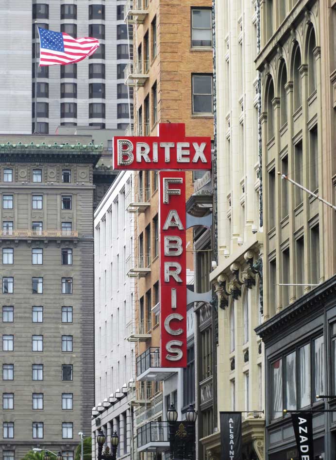
Sign spotted in San Francisco, California
– –
ed. note: Nikki Villagomez will present her talk, How Culture Affects Typography, at the Wacom Experience Center on Tuesday, October 2nd. Using photos from around Portland, Nikki will discuss how our use of typography affects and shapes our regional culture.
– – –
 Erin Lynch is a designer, writer, and educator living in Vancouver, WA. He owns the design studio, Shop, and is an editor at The Portland Egotist. Reach out and make friends on Twitter: @erinlynch.