I recently had the pleasure to interview Traci Sym, one of the principles of experiential arts practice and atelier +&> (plus & greater than) in her creative workspace. I sat down with Sym to learn more about her work and how she got started in experience design. Since their beginnings in 2016, Sym and her co-principal Daniel S. Meyers have been working to create a performative experience in spaces around Portland and beyond.
How did the idea for your studio come to be?
Daniel and I have been working together since 2011. We met while working at the studio Second Story. My background is in performance & theatre, and I’ve come to interaction design through working in museums on the east coast. I spent many years working at the Holocaust museum and came out here to broaden the kinds of projects I could work on. Daniel’s background is in architecture, and he had come into interaction design trying to re-imagine what architecture could be for him.
When the studio was born, we didn’t want to define ourselves as people who always used technology. We are both especially influenced by spatial design and spatial narratives, such as how to create stories in places, for people. We love working with cultural institutions, and our practice has been shaped by that — creating value for everyday people, and helping to educate and inform them of different ideas from around the world that they don’t necessarily get to experience.
What could someone expect to see at your studio or at an exhibit?
With starting this practice, we were inspired to create an atelier/workshop that is constantly making, changing, and prototyping ideas. Part of the reason we are in this industrial neighborhood (Iron Fireman Collective) is because we wanted a full shop where we can build physical components. With our performance background, we also carefully consider how to prototype human experience. A lot of our projects are long term, and so we can go into design work having a clear idea of what we want to make, but we also consider what other people are looking for and how they are going to respond. The emotion and behavior that spacial design influences is absolutely important to us.
We collaborate with artists to produce one to two performance pieces per year, which allows us to be face-to-face with audiences again so we remember what that feels like. So much of interaction design is putting things in front of people and you are never there to see their reactions, with the exception of testing in the context of interaction design.
We completed a project with four other artists this past summer, called Distances. It is a good example of a site-specific installation and performance, where we made the audience travel with us to separate rooms, and within each room was a different performer, all based around the idea of communication. For us, it was a unique challenge of figuring out what it meant to have an audience member participate if they feel comfortable, and balancing that with when they say “too much” and get uncomfortable. As designers, when you’re making exhibits, you’re asking your content to do that for you. You aren’t there to look in someone’s eyes and ask people to be vulnerable in a lot of situations. You aren’t there to support them. To stand in those moments and remember what that feels like, extremely important for us to understand how to design with empathy.
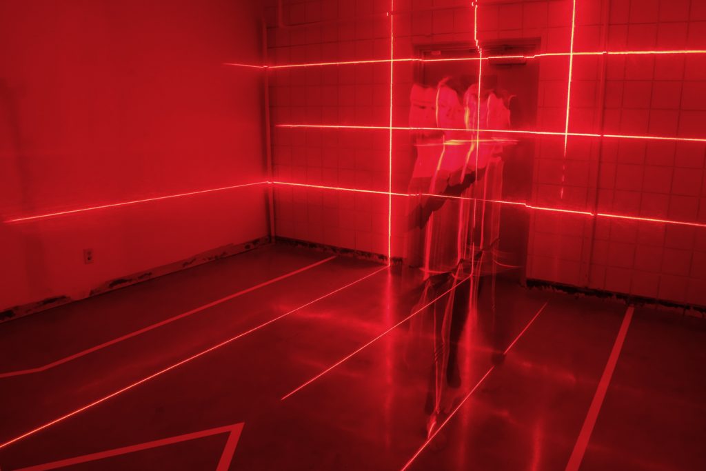
Photo of Distances courtesy of +&>
A lot of our projects are extremely family-focused. Some are at OMSI here in Portland and some at the Chrysler Museum of Art, and we are working on one right now for the National Building Museum. For these family projects, it’s really easy to dumb them down, and not think of ways to create challenging and sophisticated experiences for audiences of all ages. That would be a miss. I think that when you challenge someone to figure things out and experiment with the way things work, they are much more engaged when you are trying to get them to do things. That is the same for adults as it is for little kids.
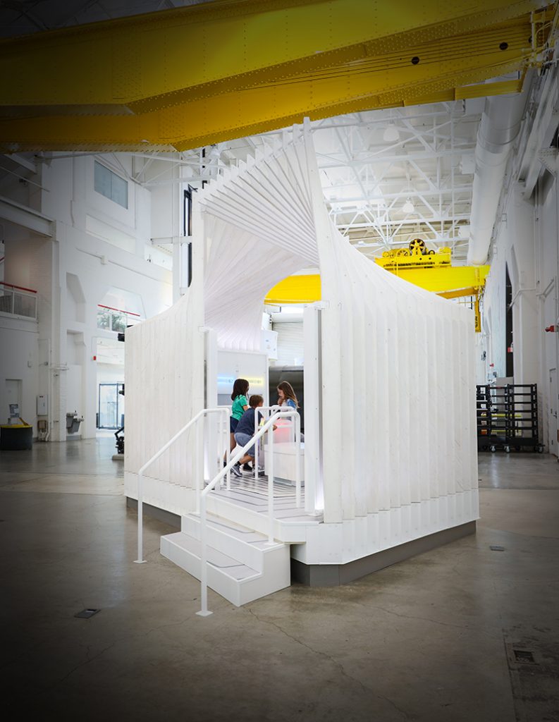
Photo of Distances courtesy of +&>
Our project at the Chrysler Museum, which is in collaboration with the Portland studio Upswell and Bruce Wyman, is based in Norfolk, Virginia and a popular spot to bring families. A lot of the visitors didn’t understand how to interact with the art; a lot of parents were worried their kids would break things, and didn’t know how to talk about the work. So they were looking for us and their partners to create the Wonder Studio, which is a way to integrate technology and art experience for families where they can goof up, make a mess, and just experience what art and art-making is like. What was cool about that project was, in the beginning, they wanted us to put some art in there, and some of the parents were pretty nervous about putting real art in the space. That seemed like a mistake, so we asked, “What if we put all the art in the space… absolutely pack it out with art?”
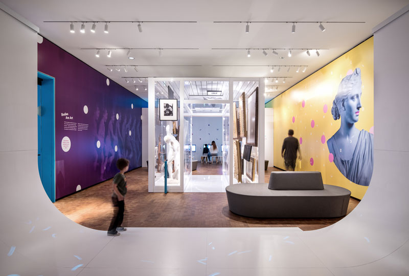
Photo of Distances courtesy of +&>
If you go to an average gallery with a little kid, all the art is way above their heads; they can’t connect with it. So we designed this tube called “The Artquarium” that guests can walk through. We packed it full. Almost $40 million dollars worth of art pieces hung salon style, so artwork is all around you. All the art is protected in a big acrylic case, so visitors can squish their faces right up against the glass and see the back of the paintings, how they are hung, and what the back looks like. We also built all these sound tubes where you can interact with the tools to hear stories about the art. In one you may hear a lady singing about cats. It’s just meant to be playful and weird, for you to experience art in the way you want to experience it, with your family.
All the work we do is new; it’s never been done before. So we’re making assumptions as to what we think will work with an audience and sometimes we need to shift those assumptions and the media we are working with when people are actually in the space.
Where did the unusual name come from?
So the idea for +&> came from us being in collaborative practices for a long time, and we think that the best work comes when you have lots of people at the table to help create a vision. We all have differing perspectives, and we are more and greater than the sum of our parts. This does not just refer to us and our ideas, but also to creating a collective environment with our clients and our design partners so they can have a voice for what gets made. We’ve worked in design practices so long, and it doesn’t matter who has the best idea, or what discipline that person comes from. If I’m in a room with developers, engineers, and architects, and someone has a great idea that meets what we are trying to achieve, we should all get excited about that. We’re trying to break down the hierarchy of a lot of design practices, so if you can be open-armed and collaborative, you can make way more interesting work, and feel better about it, because you’re doing it as a team.
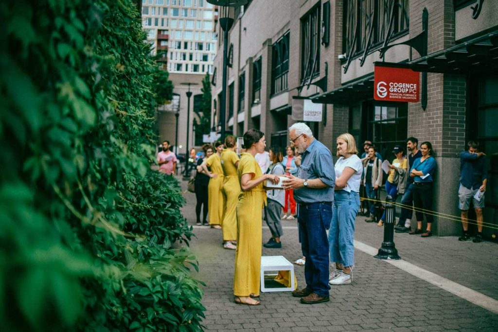
Photo of Distances courtesy of +&>
How does your background in performance and theater feed into your design practice?
For a lot of years, I didn’t realize how much my theatre background influenced the way I go about design. I think it comes from a love of simplicity and understanding the power of space and simple tools. In theatre, you are trying to create a truly intimate connection with an audience. When you are on stage, it’s a conversation. It’s a dialogue. It’s not just me performing and you watching. Using super simple tools, like light or sound, or an actor stepping into the light from the darkness, is a powerful thing for audiences. I think finding those choreographic ways to think about experience and storytelling has informed the way we work. We think a lot about the place where something is happening, the story we are trying to tell, and the people we are going to talk to.
All of theatre is about listening and responding. That is the only two things you can do while you are on stage: you can listen or respond. Our work is about trying to find that balance by finding that tension between making things challenging in a way that people find intriguing, or makes them curious to explore and experience things.
In experience design, we find a lot of technology is wanting people to think of things as easy to learn or intuitive. The more intuitive something is, the easier it is for people to go about using it and weaving it into their everyday lives. The work we are doing is trying not to be intuitive; it’s trying to make you think. That doesn’t mean everything about the experience shouldn’t be intuitive; it means we need to find some meat, some substance we need to hold on to that makes us want to know something about the world we don’t already know. We’re more and more afraid to step outside our comfort zone. It’s important to feel vulnerable as a designer when we’re asking people to feel that discomfort in the experiences we create.
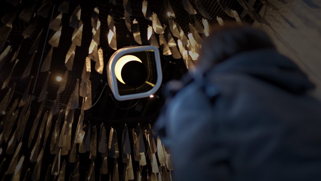
Photo of Distances courtesy of +&>
How could students & young designers “dip their toes” into creating performance experiences and immersing themselves in interaction design?
Try. Try something. A lot of times when we think of performance we think of large theatre spaces, large audiences, or a large production budget, but you don’t need all of those things. You can create a performance piece by walking down the street. Experimenting with the places around you is very helpful. There is one exercise we do, a listening exercise: walking a route you might travel all the time, but without talking. Walking with someone else without speaking, there is something kind of incredible taking that time to realize what are the things you notice when you walk through an environment and just listen to everything happening around you. It makes you tune yourself to listening. I think even simple exercises like that, performative in nature, can help reconnect you with environments you experience all the time, that you might not pay attention to anymore.
I’m also a big proponent of the Viewpoints study and exercise, created by Anne Bogart and her partner Tina Landau. Basically a performative practice about space and time and a training methodology for actors, I find it to be stimulating for design, making you think more carefully about your environment and interactions with other people in real time. For Portland Design Week this year, Daniel and I are teaching a workshop on performing interaction design, as well as at PNCA’s Make+Think+Code, with a lot of professionals coming to teach about technology and interaction design.
What are some of your favorite narrative experiences?
One of the most incredible art experiences I had recently was this teeny tiny museum in the Italian city of Varese. The Villa e Collezione Panza is a mansion on a hill, this big beautiful property overlooking the town. Owned over the years by different socialite families, eventually it was purchased by this family that collected a lot of American contemporary art. The owner was someone who was interested in the artists James Turrell, Robert Irwin, and Dan Flavin, very early when they were just starting their careers. He invited them to experiment with his property, a 16th-century chalet in Italy, which is incredible and such a juxtaposition to their work.
I’ve been fortunate enough to visit many of Turell’s installations. Because they are built in the same way each time, they create an incredible sense of place, but they aren’t necessarily tied to the physical place they are in. His installation for this mansion is tied specifically to this room that you are standing in, and it was unbelievably powerful. Imagine, in this semi-rural town off the beaten path, industrial and quiet, to experience this contemporary art that has been in this space for a long time…. the stark juxtaposition between sleepy Italian town and particularly contemporary art blew me away.
Another favorite is the National Gallery in Victoria, Australia. I was there recently for the triennial with my children, and I was especially blown away by how they catered to visitors of all ages. My children are forced to go to museums all the time and they don’t always love it. Some of the rooms were so tactile and engaging and felt truly inclusive, so all visitors could enjoy the experience. It had this beautiful narrative arc surrounding the idea that the whole museum was about exploration. Even the outside area had a play space for kids to climb while parents might enjoy a glass of wine. Everyone who went with us felt particularly engaged, even after spending 8 hours in a museum.
Do you have any words of wisdom for young professionals trying to get into interaction design?
If I were to provide thoughts for young professionals trying to get into interaction design, I would say don’t be afraid to get your hands dirty doing things that don’t seem like they will be paying off in the short term, but will pay off in droves in the long term. Careers are never linear. Both Daniel and I have taken rather meandering paths to get to where we are. What always blows me away about that is you come into a project and realize something you did 15 years ago, that seemingly had no purpose to what you’re doing now, suddenly becomes the thing that allows you to crack open this problem that you are trying to solve. Having diverse experiences that challenge you open up a whole way of seeing that not everyone gets to experience. I started in theatre, and then I went into graphic design at an investment bank redrawing people’s maps and retracing logos, training people to use CorelDRAW and Photoshop. I did so many random things, but random things create this colorful, wonderful, palette that you can draw from.
So I guess what I mean is to remember all things are additive, they shape you into the kind of designer and the kind of human that you want to be in the world, and that all takes time.
About the Author
 Devon Huck is a recent graduate in industrial and interaction design, passionate about sustainable products, innovative user experiences, and bagels. Currently on the search for her next opportunity, you can see her work at www.d-huck.com.