We called upon the Design Arts students at Pacific Northwest College of Art to lend their fresh creative ideas to help promote these shows. The Design Arts department at PNCA is comprised of students majoring in illustration and communication design – two disciplines that intermingle and blur as the students progress through their education and careers after school. Design thinking and illustrative storytelling are at the heart of the student experience. By the time students are in the Advanced Studio course in the final year of their studies, they are developing their portfolios to compete in a job market and professional path that’s likely to continue to blur these lines. As students in both these practices near graduation, the need to master both visual and verbal storytelling grows.
Kristin Rogers Brown, Assistant Professor of Illustration at PNCA and Art Director of Bitch Media, and Thomas Cobb, Assistant Professor of Communication Design at PNCA and Senior Art Director at R/West, worked closely with seniors at the school. Students were asked to develop a range of creative directions for the AIGA board to review. Board members then ultimately chose one direction for the students to develop into a final poster and promotional graphics.
Students were asked to consider:
- How can you interpret the work of another artist in your own style?
- Do you borrow from the artists’ concepts, executions, or materials?
- What makes a good poster design? How can that design be translated into other media?
- Can you conceive of a graphic direction from the start that might be flexible enough to accommodate both artists? (The lineup for the event was not yet confirmed at the date of the assignment.) Or, would you start with one creative professional as initial inspiration, then bend the concept to include the other?
Students all submitted comps for the poster and submissions ranged from the serious to the whimsical, some drawing more on typography and others more on imagery. Some were inspired by the topic, some by Eddie Opara’s process. With the exception of photographs or drawings of sharpies, no one theme prevailed.
The winning poster design was created by Alex Gregory, a design student finishing up her thesis year at PNCA. When asked to speak on her process for the project, Gregory answered, “The first step is getting to know the artists’ work. If you’ve only seen a couple of their projects you won’t have a very good sense of their style. From there you should try to find similarities in your work and their work. If you just try to copy their style, you probably won’t make anything interesting.”
Gregory cited Opara’s use of color and typographic styles as inspiration.
The project offered a special opportunity for the students to work with professional designers who they’d never met before and connect with members of the design community. You can see the results of their efforts at PNCA’s Mediateque where all posters will be displayed during Eddie Opara’s talk.
Winning Poster Design by Alex Gregory
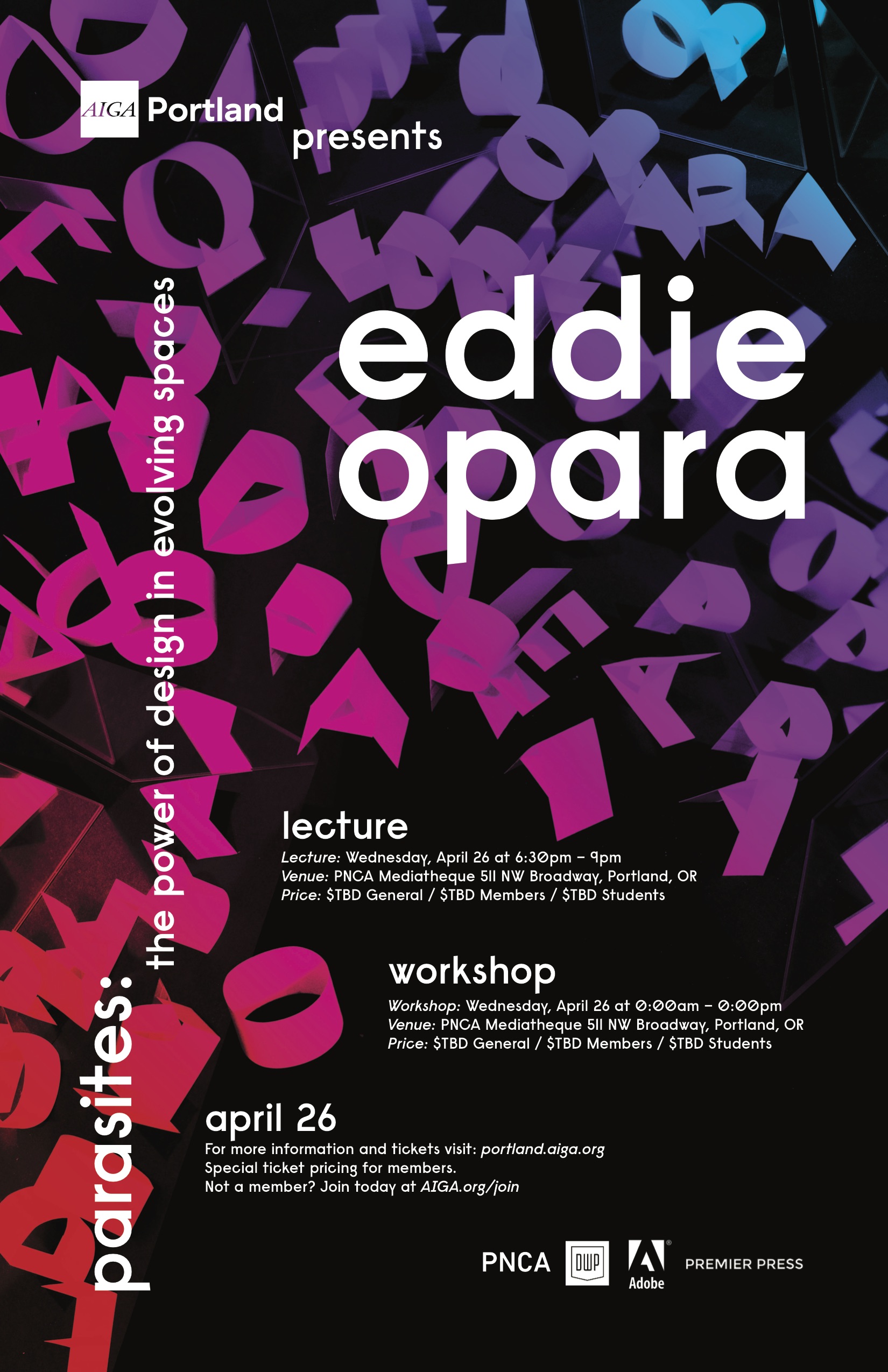
Alex Gregory, Communication Design at PNCA
How can you interpret the work of another artist in your own style?
The first step is getting to know the artists’ work. If you’ve only seen a couple of their projects you won’t have a very good sense of their style. From there you should try to find similarities in your work and their work. If you just try to copy their style, you probably won’t make anything interesting.
Do you borrow from the artists’ concepts, executions, or materials?
Looking at how the artist uses colour is really important. Colour conveys so much so quickly!
Getting a sense of the weight of the work is important too. You’re not going to use a bold slab-serif typeface for an artist that uses thin lines and organic light-weight design elements.
What makes a good poster design? How can that design be translated into other media?
A good poster design is one that is visually stimulating, can draw the viewer in from afar, and is engaging and clear so the viewer can get the information from the poster quickly. For social media you might need to distill your poster design to the necessary elements; an Instagram post might only need the event title and graphic, whereas a Facebook event photo probably needs the day and time of the event.
Can you conceive of a graphic direction from the start that might be flexible enough to accommodate both artists? Or, would you start with one creative professional as initial inspiration, then bend the concept to include the other?
After doing research about the artists, you should be excited about some aspect of their work. Using that excitement to create a concept is probably the best way to make something you find interesting. When doing client work, anything can change, so being flexible and receptive to outside input is just necessary.
Other Student Entries
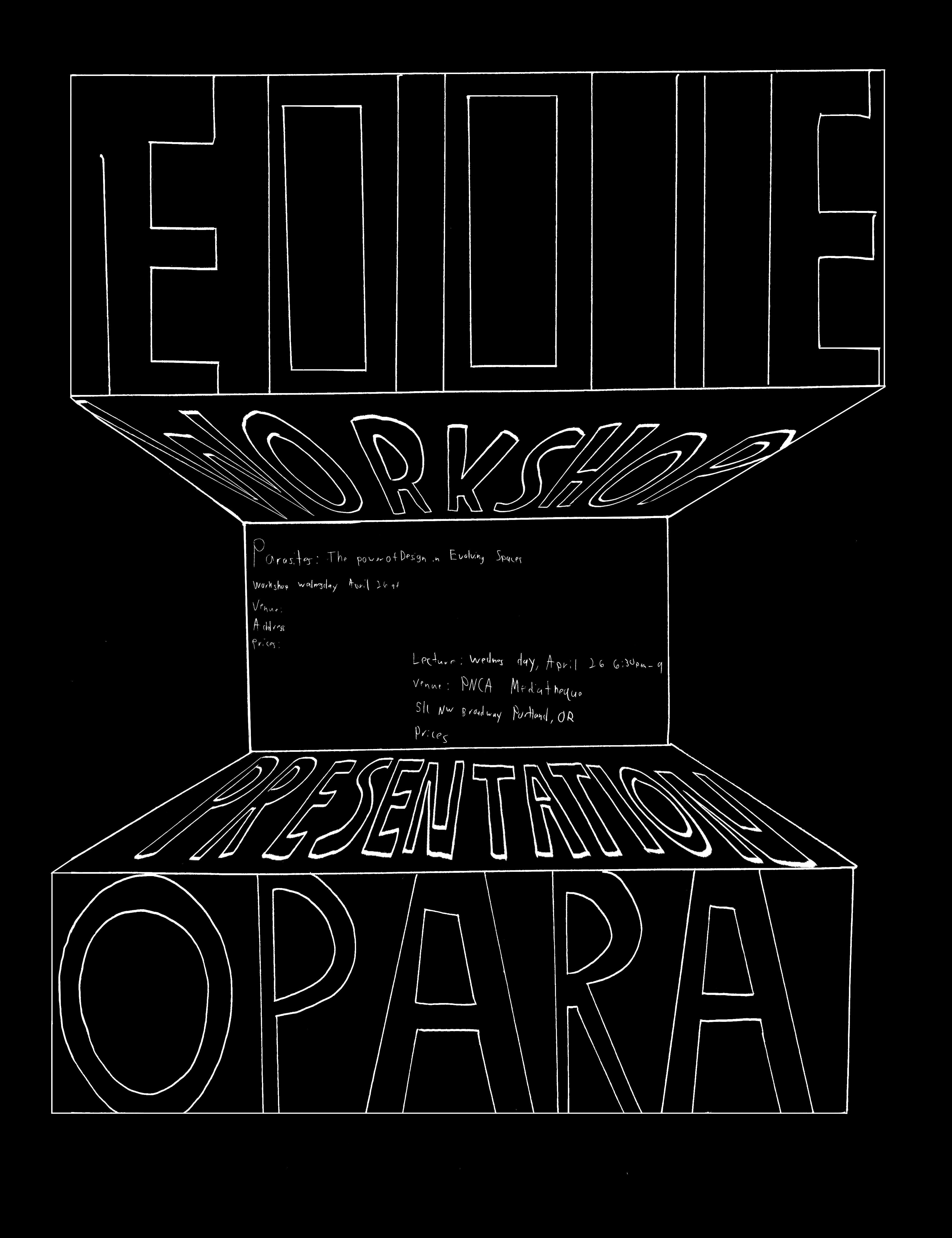
Brandon Gould, student at PNCA
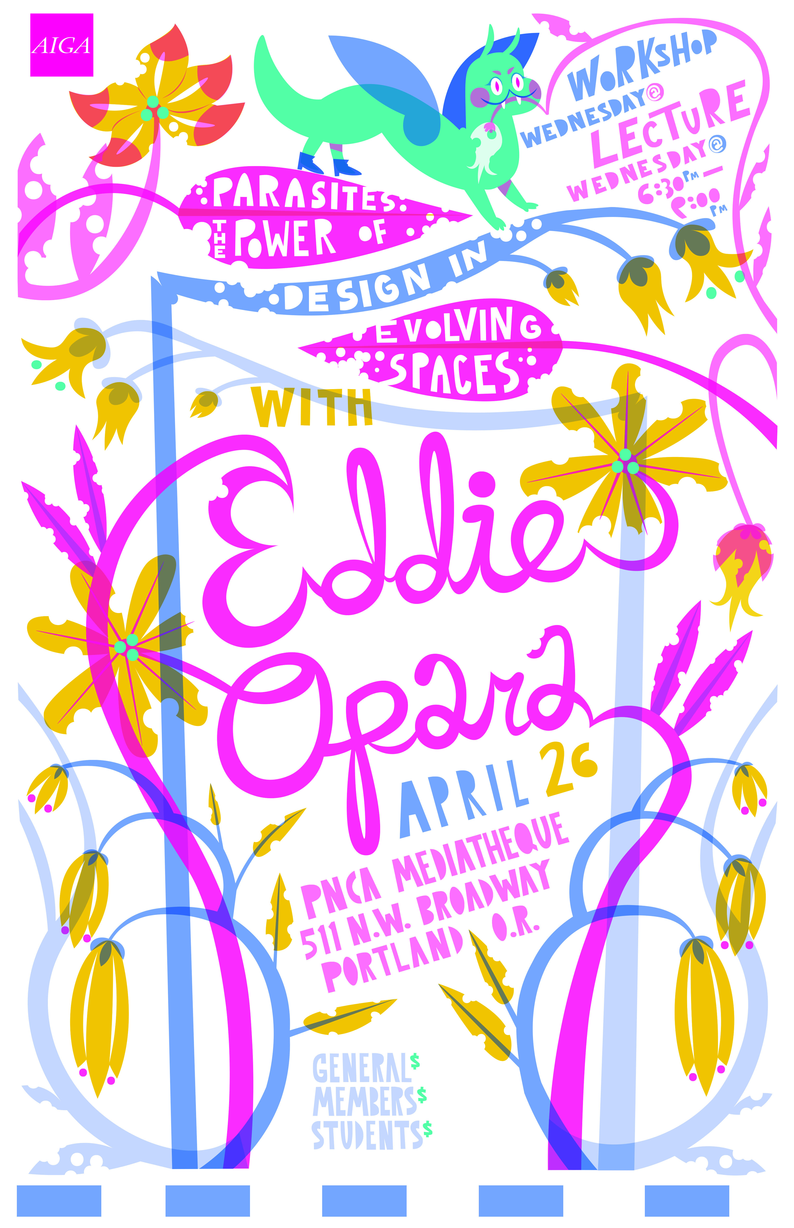
Clara Dudley, Illustration at PNCA
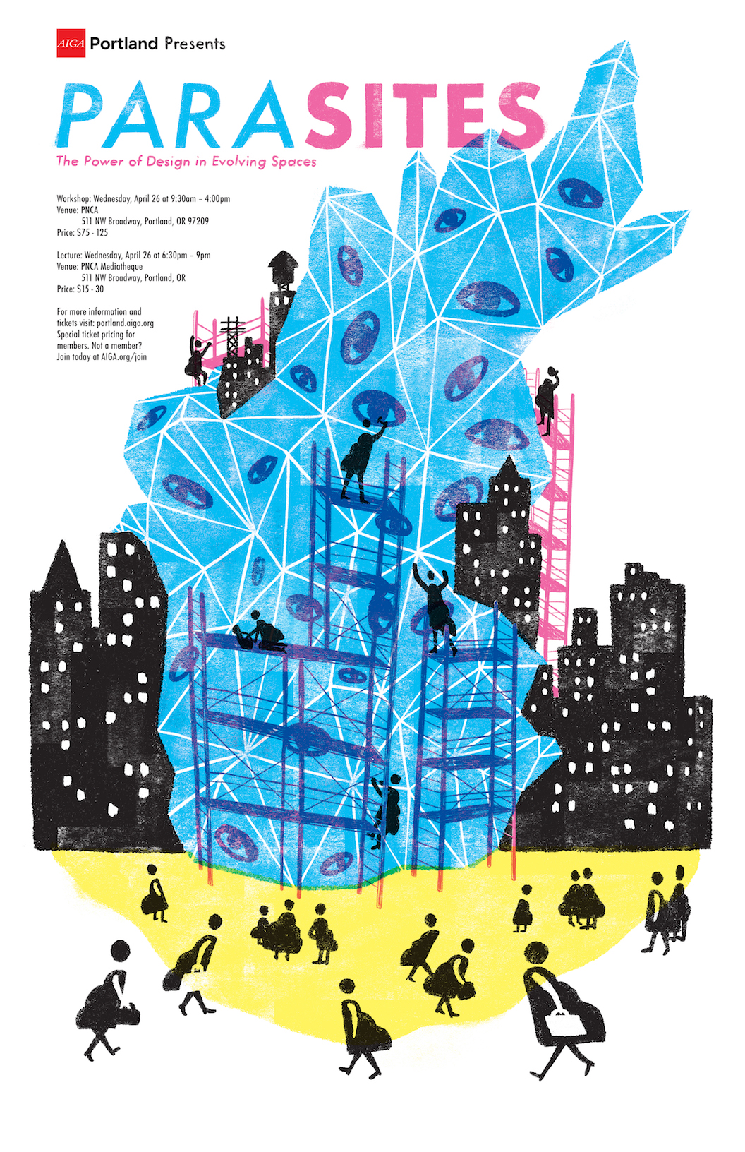
Vance Lump, student at PNCA
“In the creation of the poster it was challenging to make an image about an event that focuses so heavily on the presence of one person without making it a portrait of Eddie. I had to think about how to convey his ideas without relying on his image to carry the poster. I feel my solution ended up emphasizing the participatory nature of Eddie’s work and his emphasis on changing public space.”
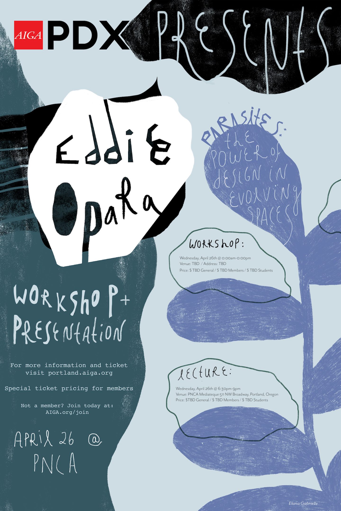
Elana Gabrielle, Illustration at PNCA
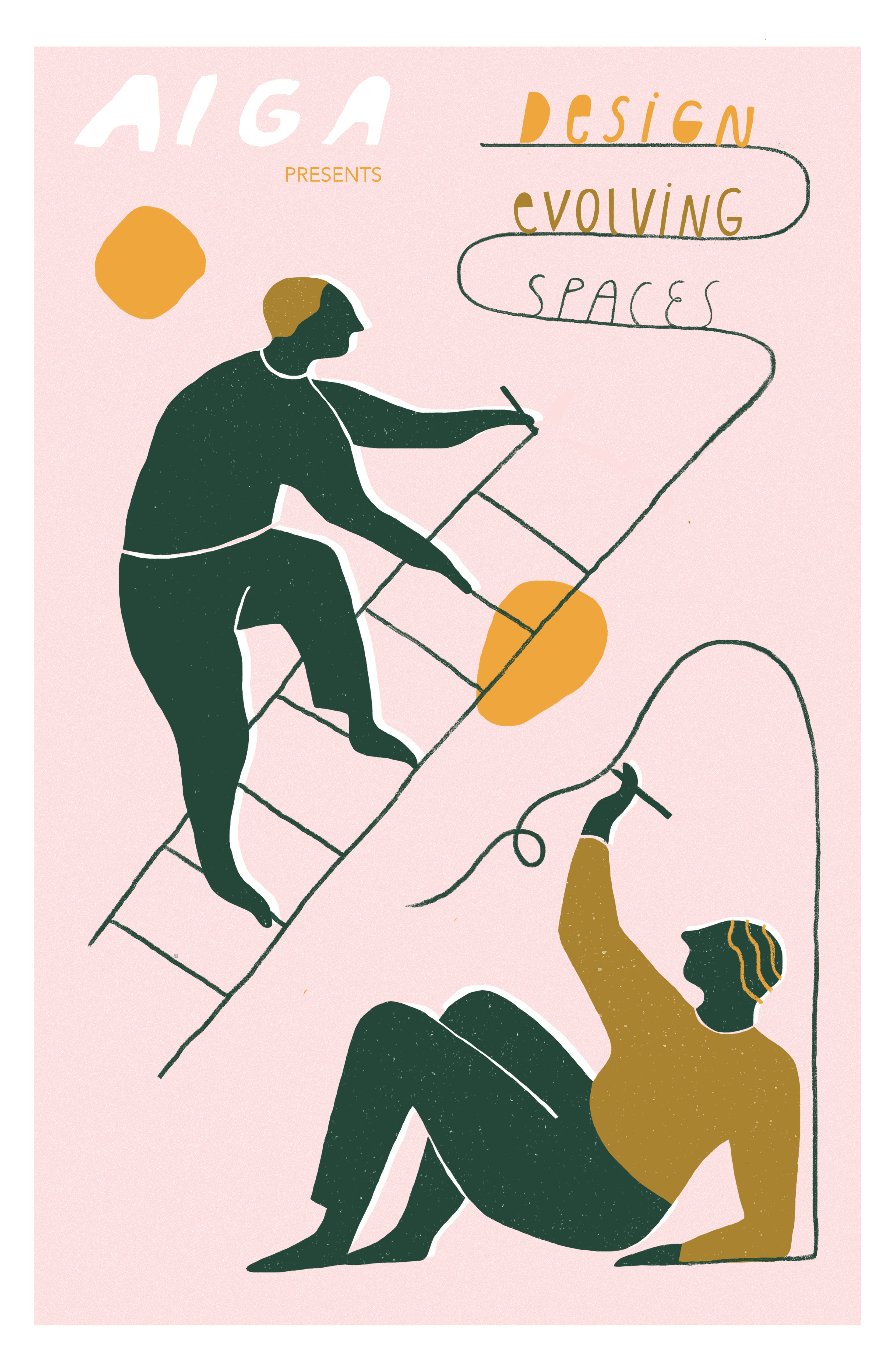
Tess Rubinstein, student at PNCA
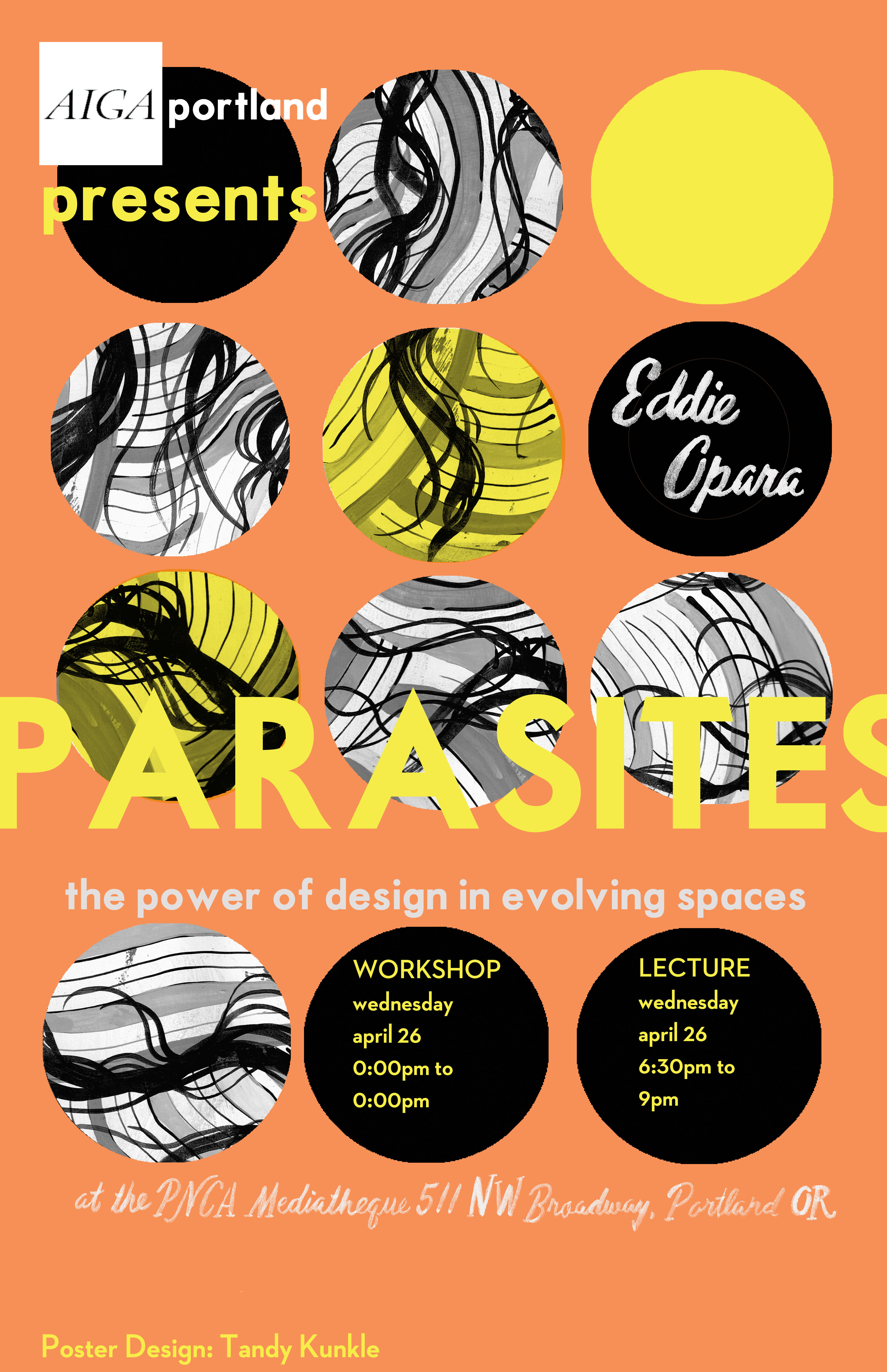
Tandy Kunkle, Illustration at PNCA
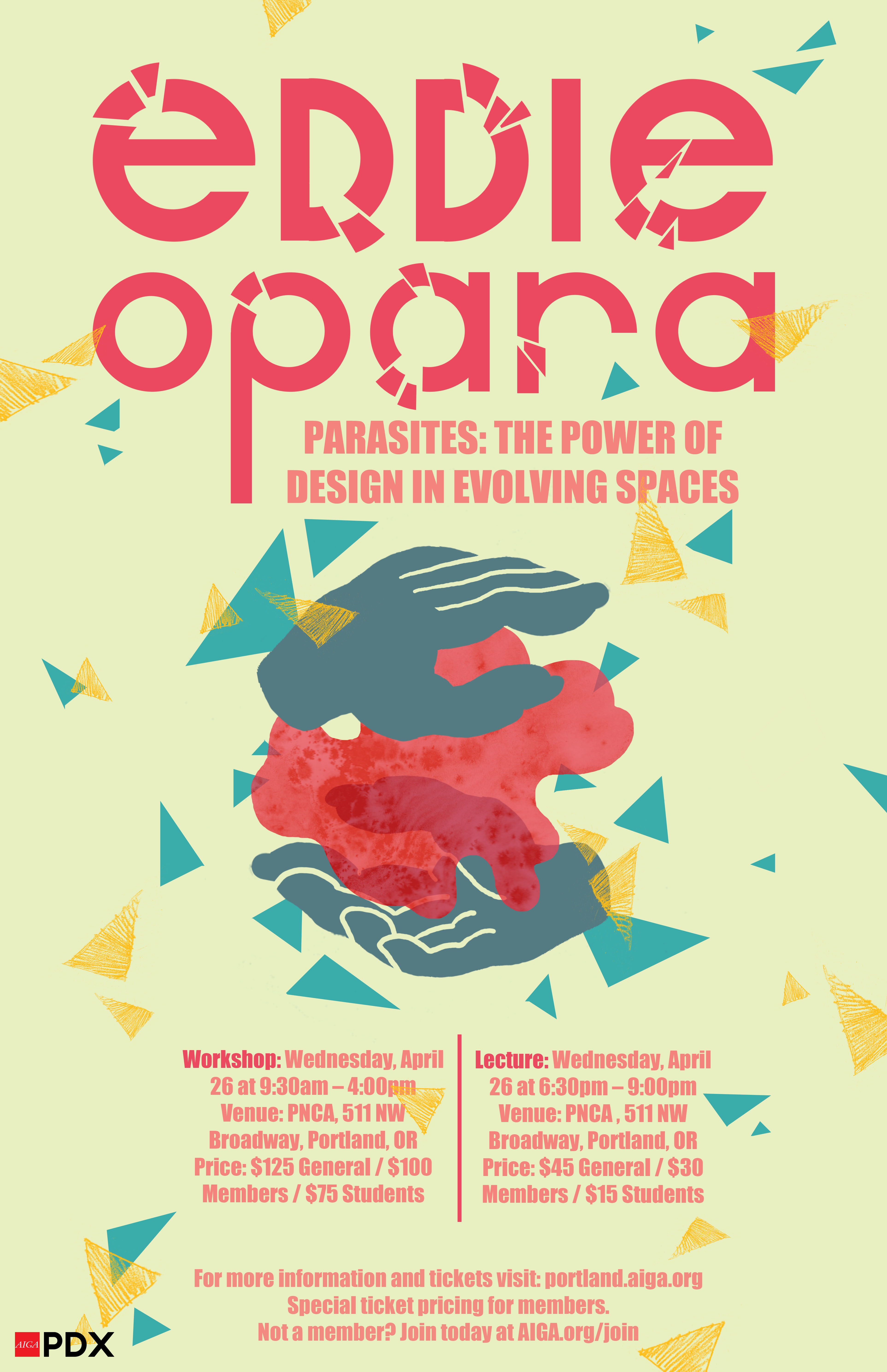
Melissa Dienes, Illustration at PNCA
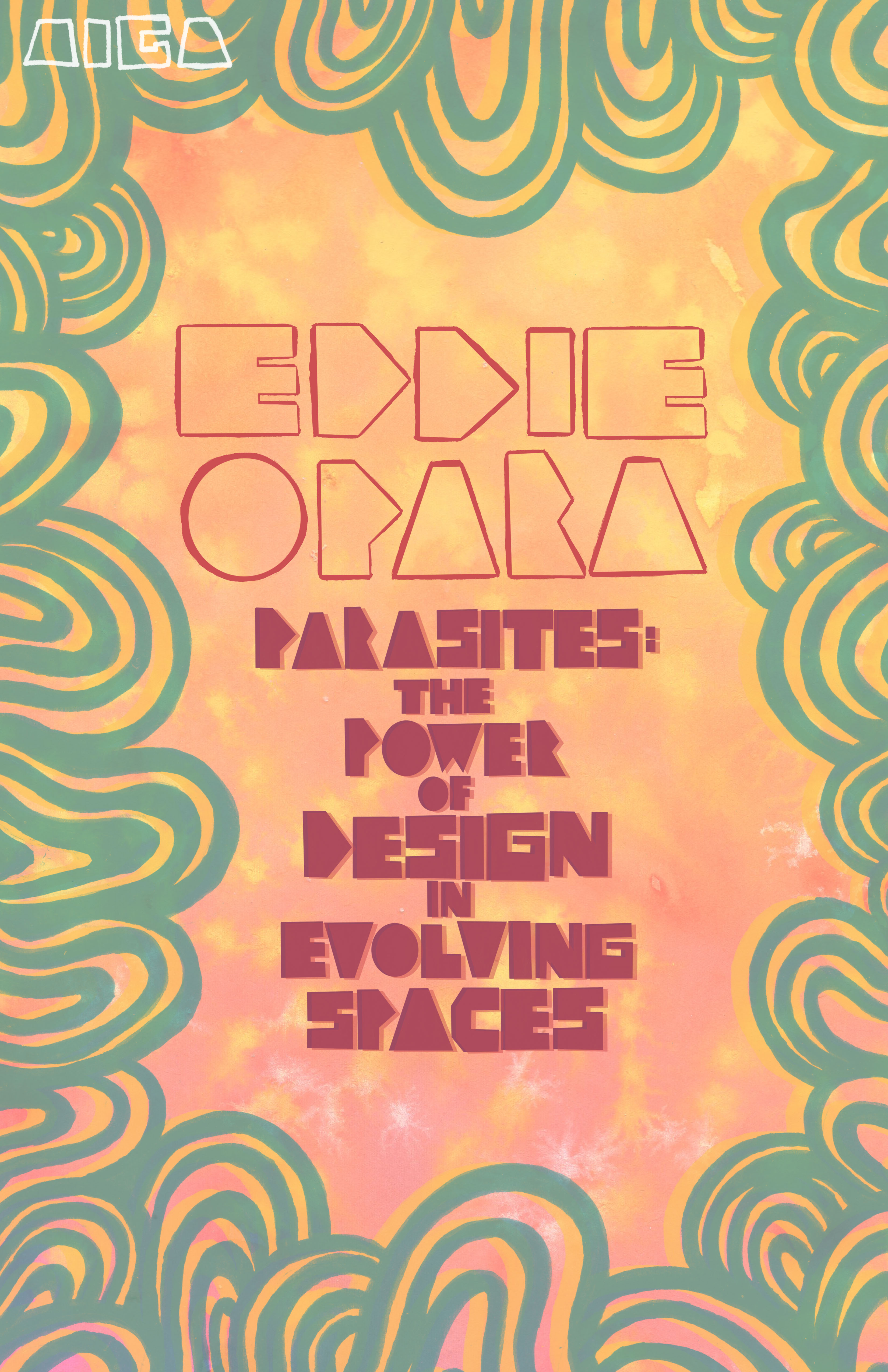
Zoe Kimball, student at PNCA
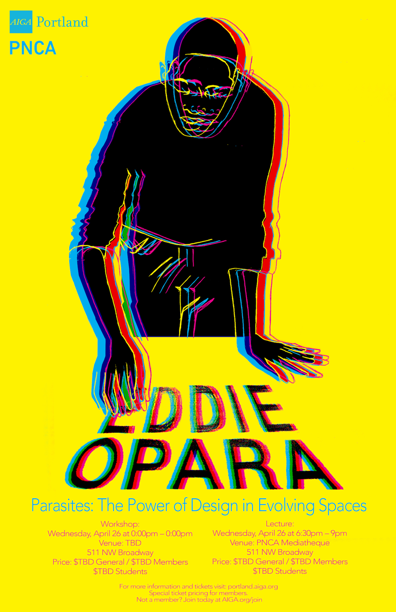
Samantha Fowler, Illustration at PNCA
Though previously unfamiliar with Opara’s work, Fowler was inspired by Opara’s book cover for Color Works. With that work in mind, they designed a 3D illustration using CMYK – a skill that they have since used in their personal works.
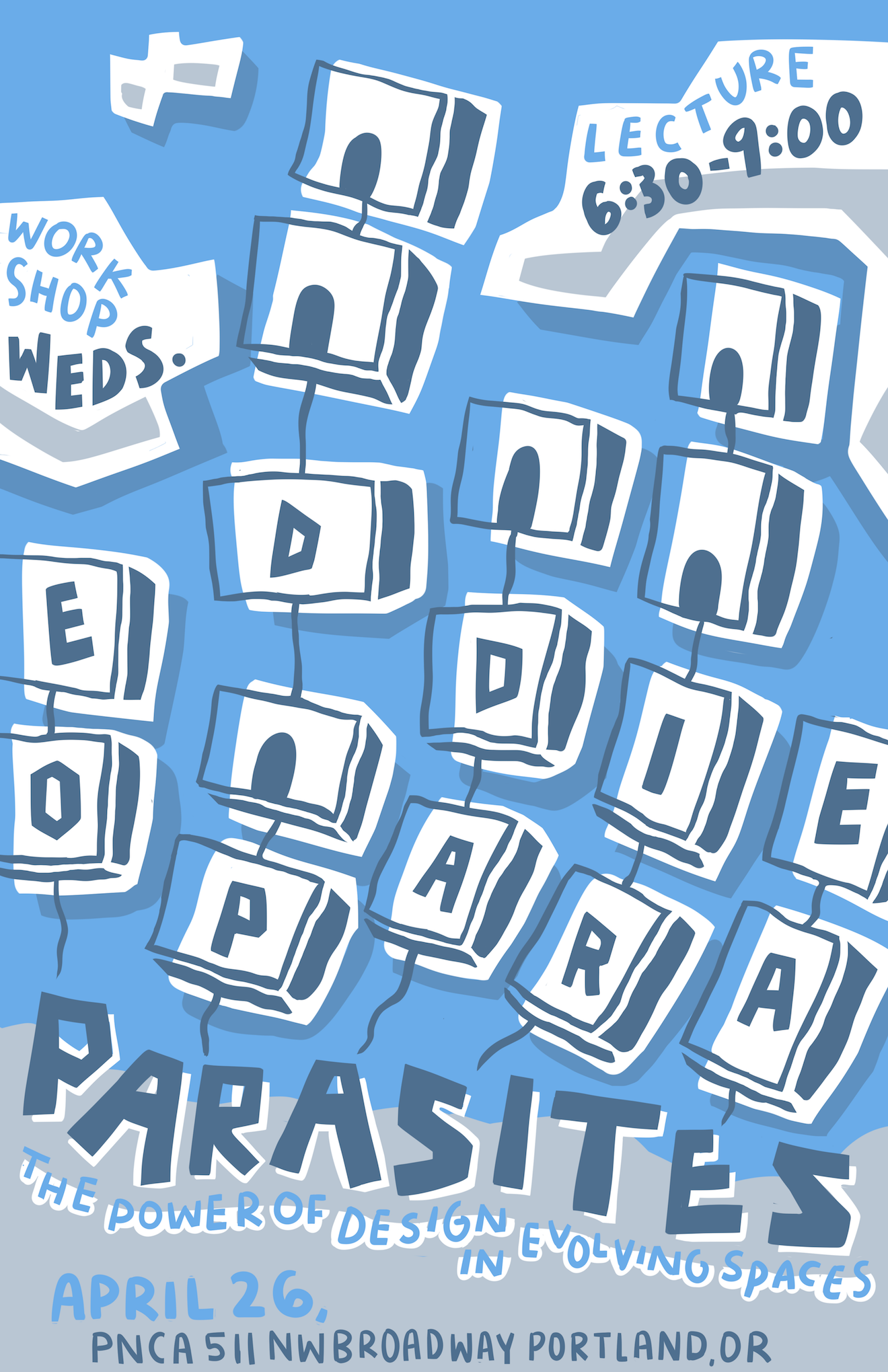
Hope Darby, Illustration at PNCA
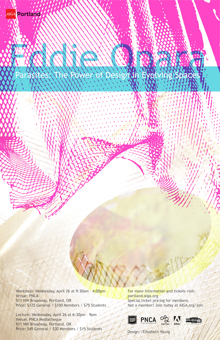
Elisabeth Young, student at PNCA
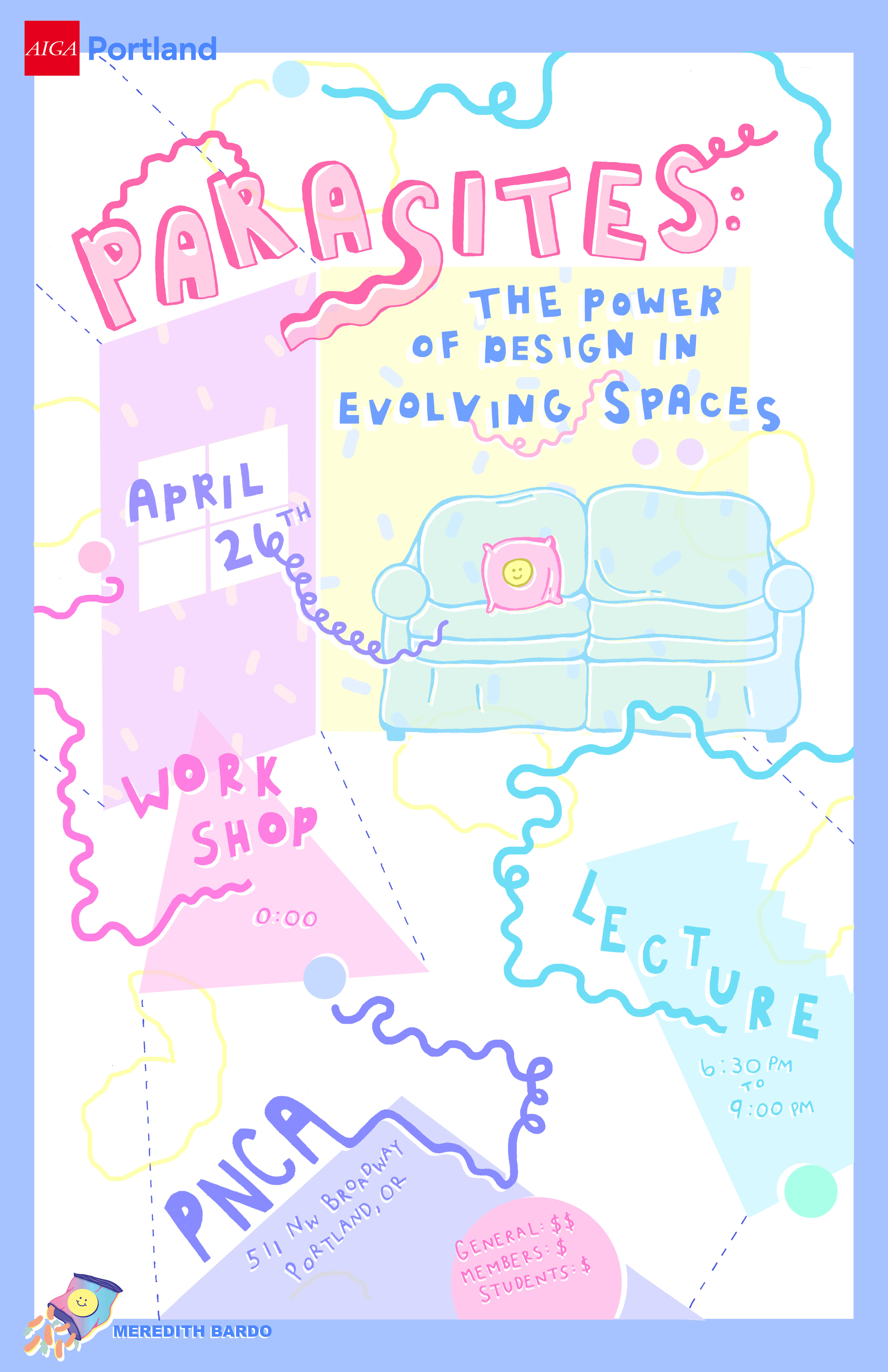
Meredith Bardo, Illustration at PNCA
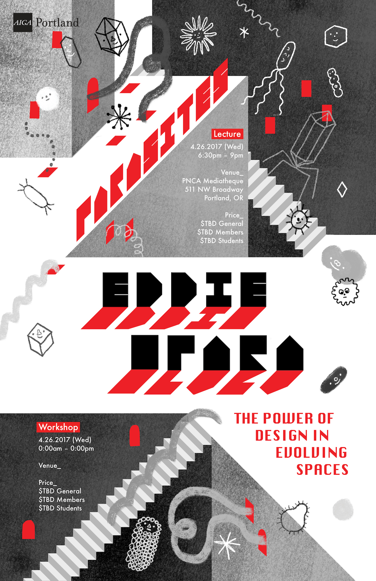
Subin Yang, Illustration at PNCA
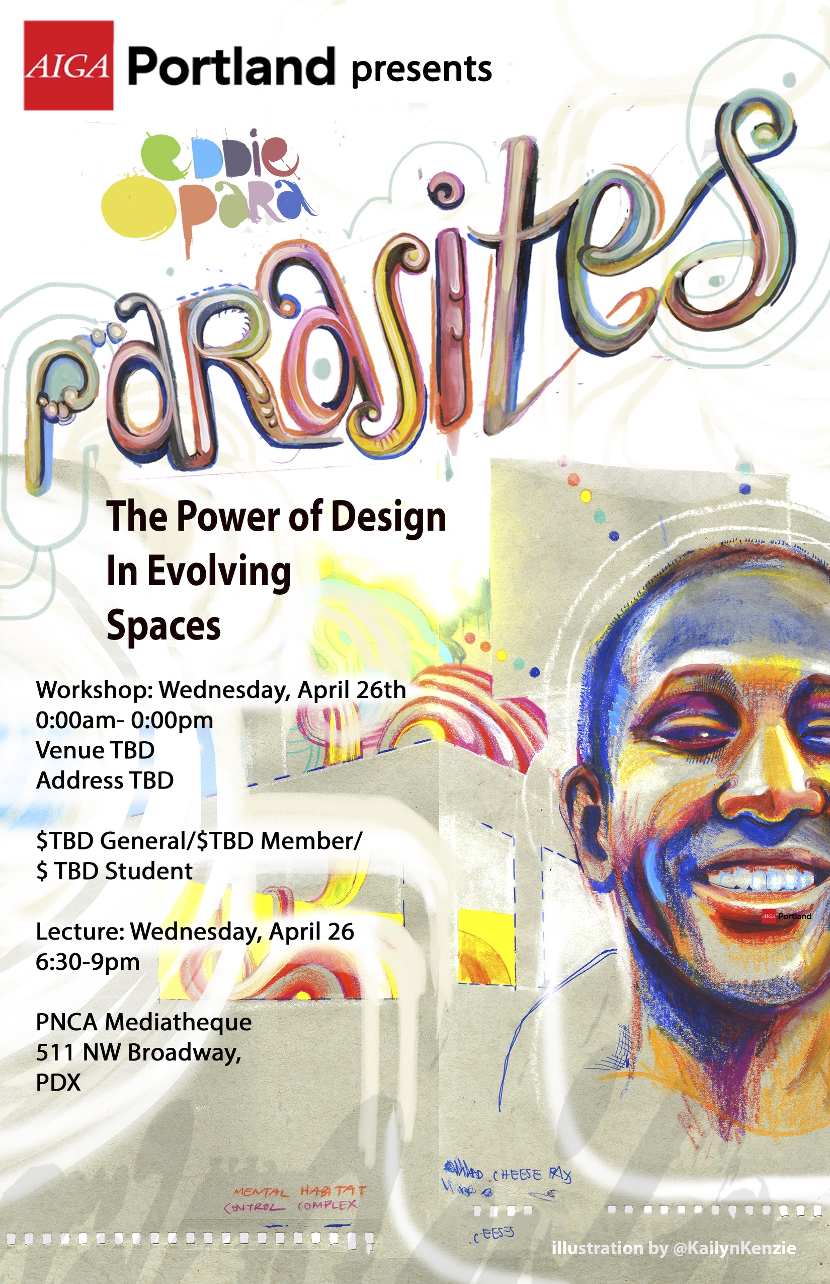
Kaitlyn Nelson, Illustration at PNCA
Inspired by the idea of parasitic work, Nelson worked to include type effectively within her work. Using a portrait of Opara allowed them to convey Opara’s personality work, considering the impact of a single person.
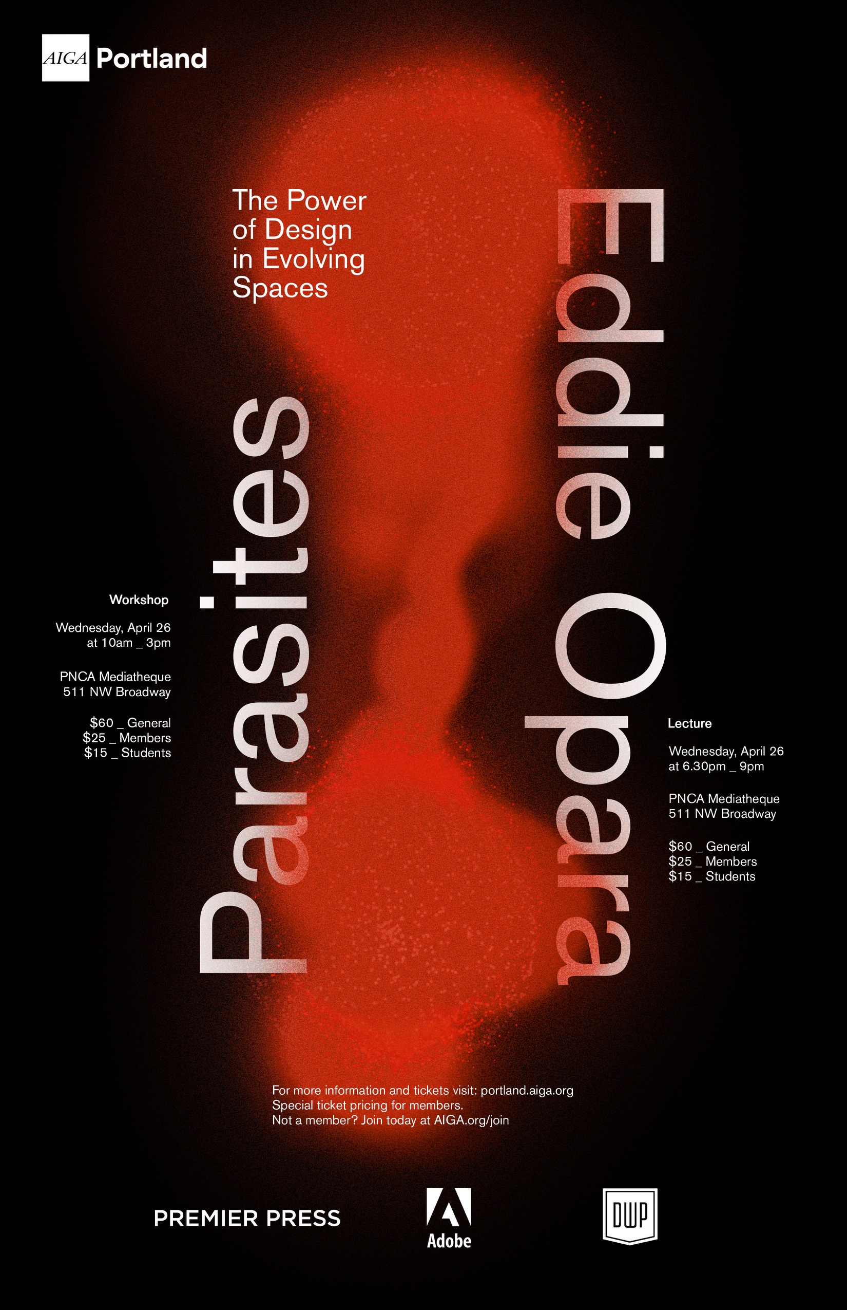
Owen Welch, student at PNCA
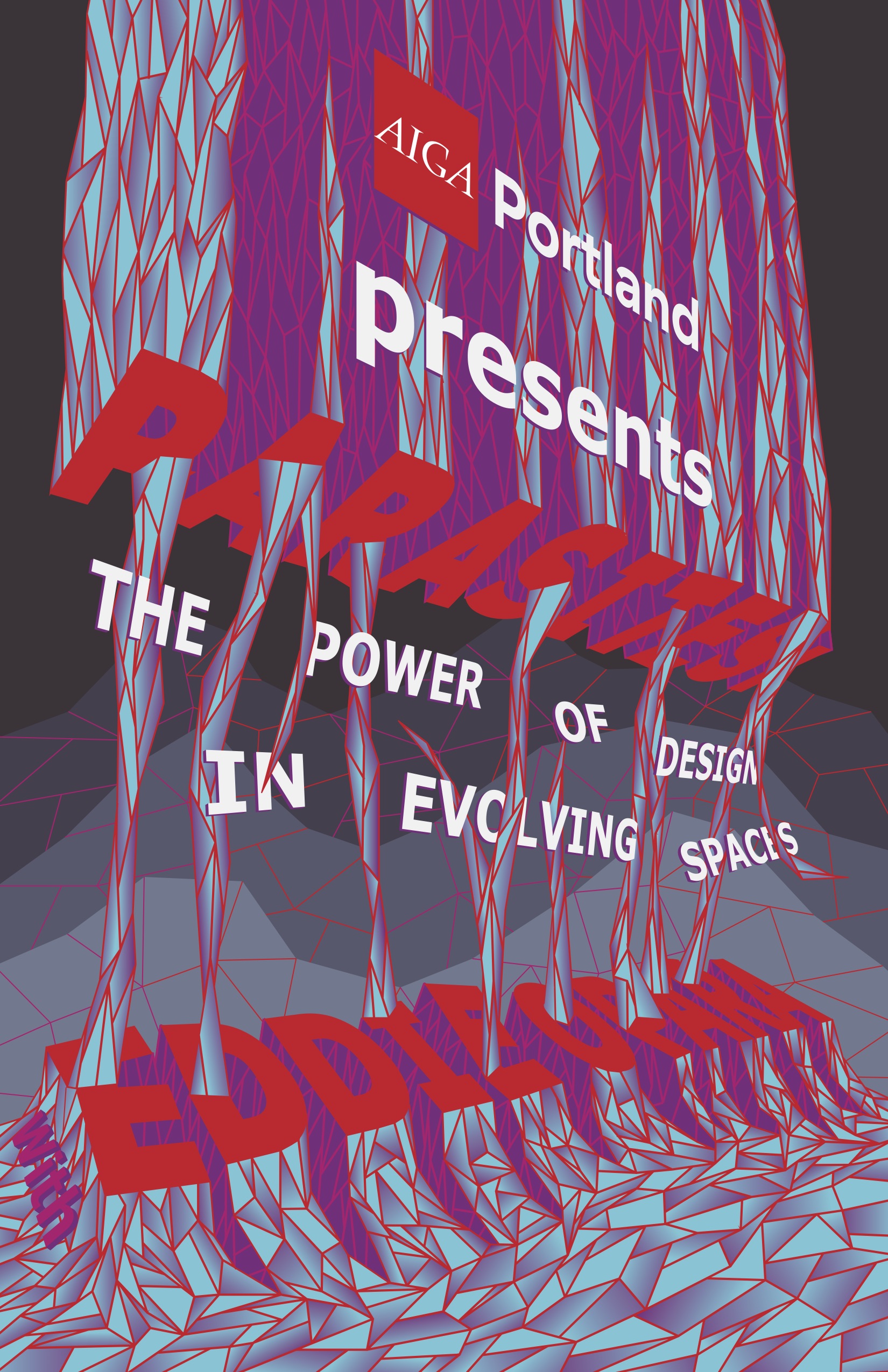
Colin Luton, student at PNCA
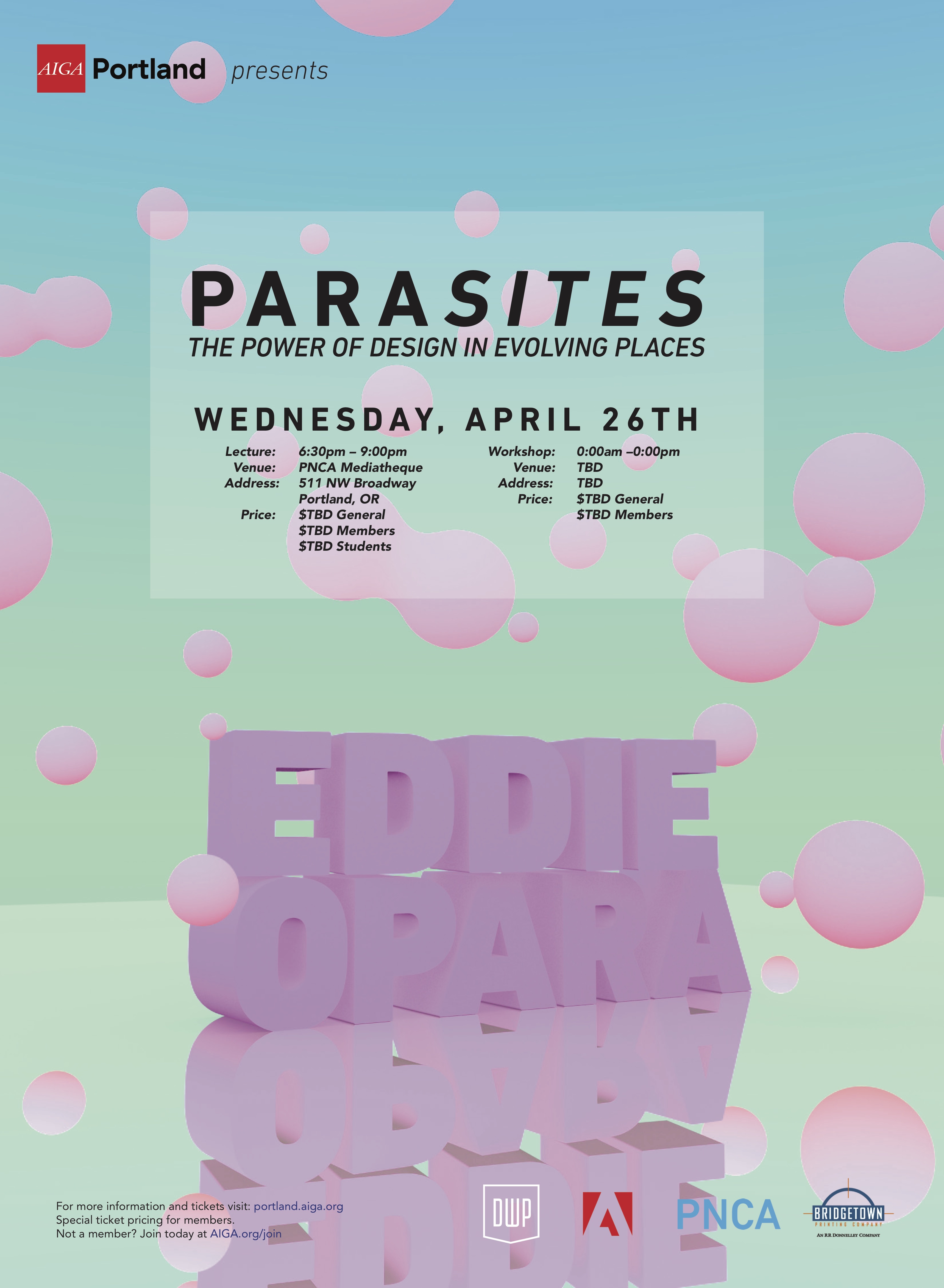
Ellen Skiff, Communication Design at PNCA
Taking cues from other artists and working to understand their methodology, Skiff is driven to understand how their work might influence Skiff’s own. By using 3D rendering in their poster design, Skiff created a system that allowed for limitless aesthetic and creative directions.
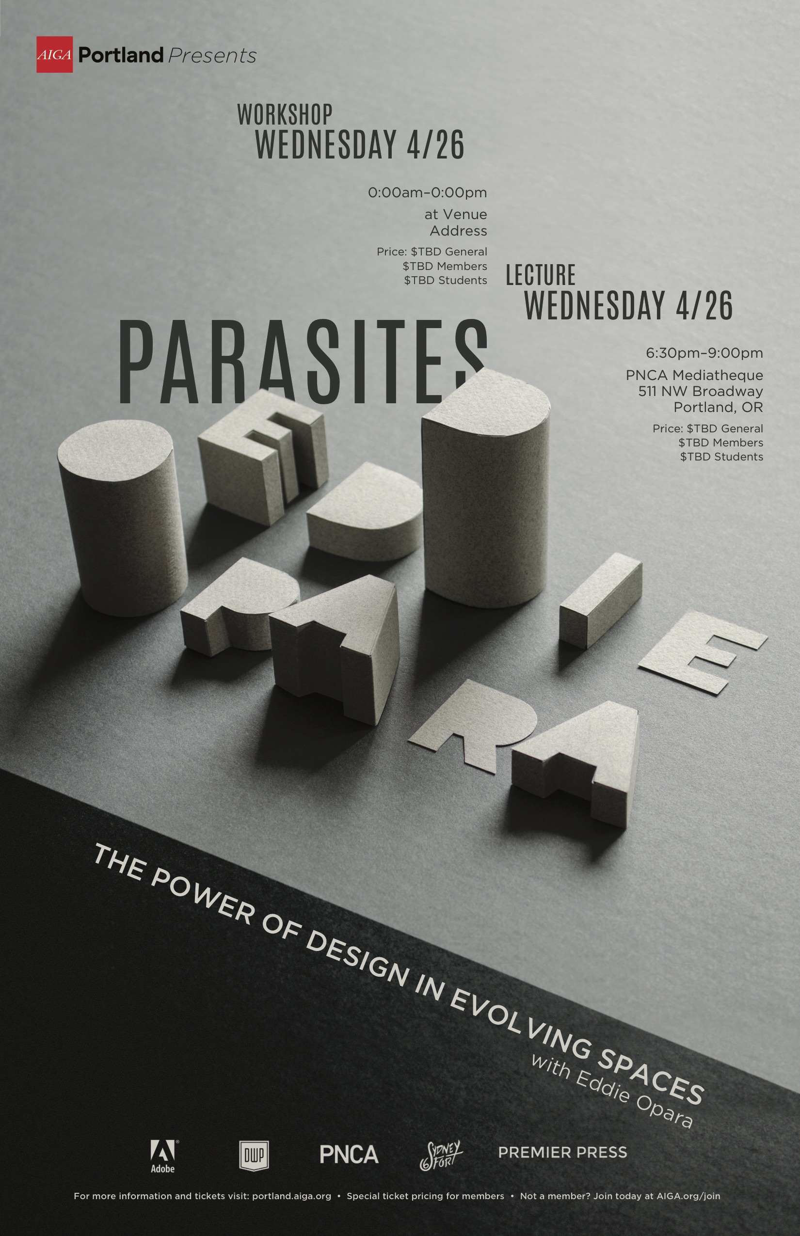
Sydney Fort, Communication Design at PNCA
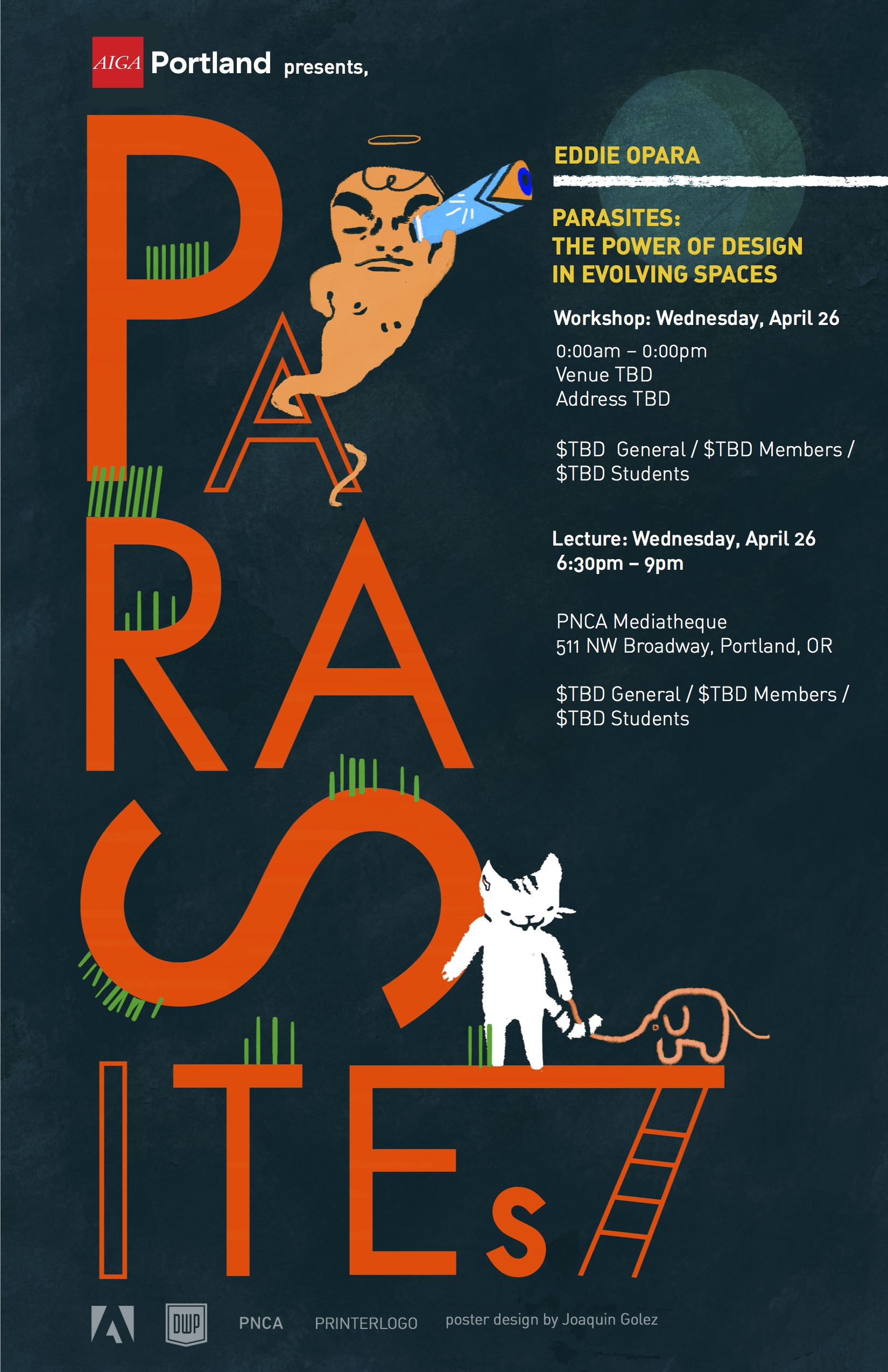
Joaquin Golez, Design Arts at PNCA
Golez thrived in the client relationship of this project, using critique and spontaneity to drive the work forward: “As a creative, the more of an intellectual and emotional understanding I can ascertain the more formed my ‘reaction’ is going to be.”
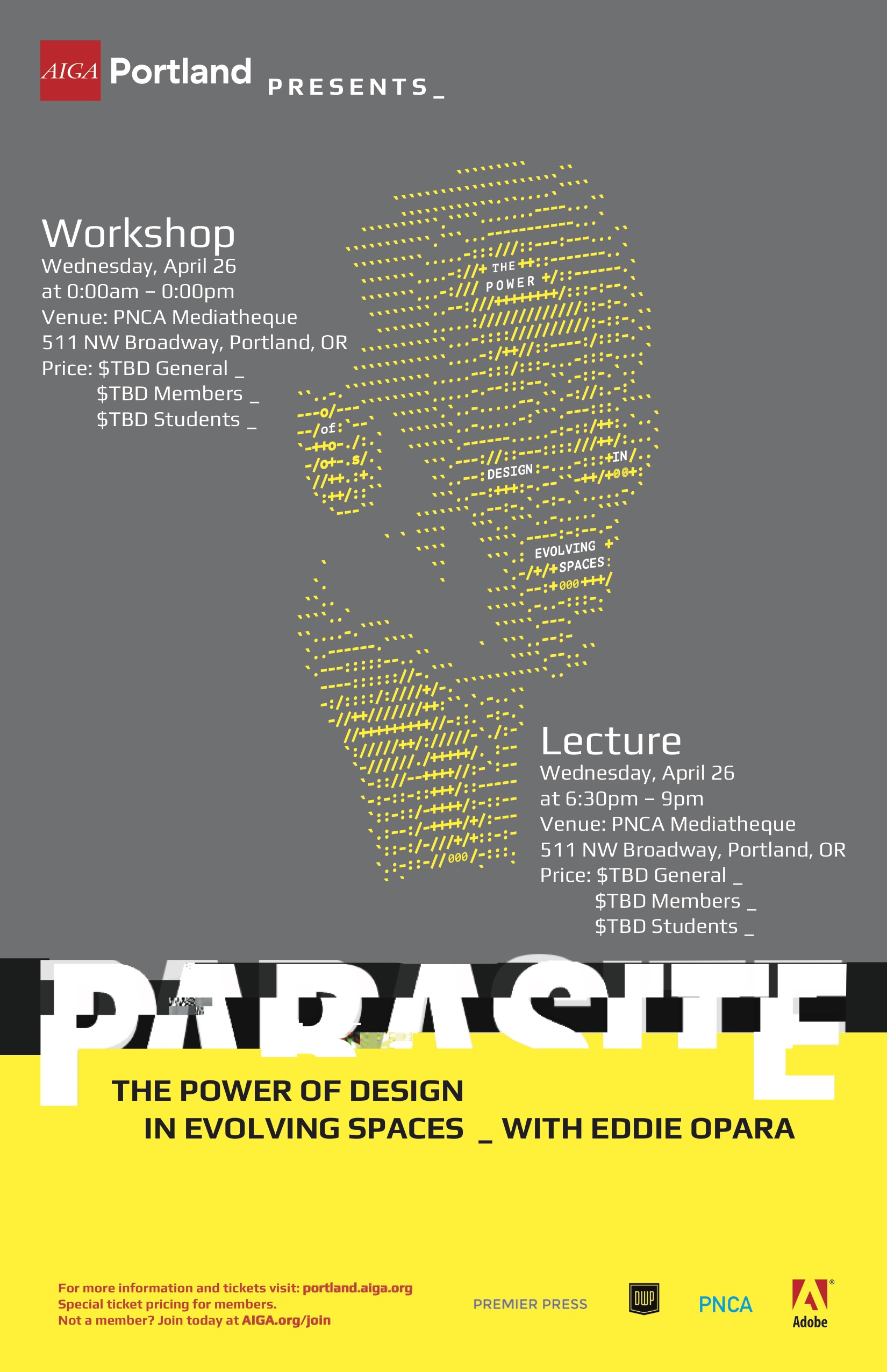
Daniel Verde, Communication Design at PNCA
“A good poster is one that is memorable. One that can be ingrained in the viewer’s mind. Whether it is in print or digital, a detail or the big picture, the impression will always be there.”
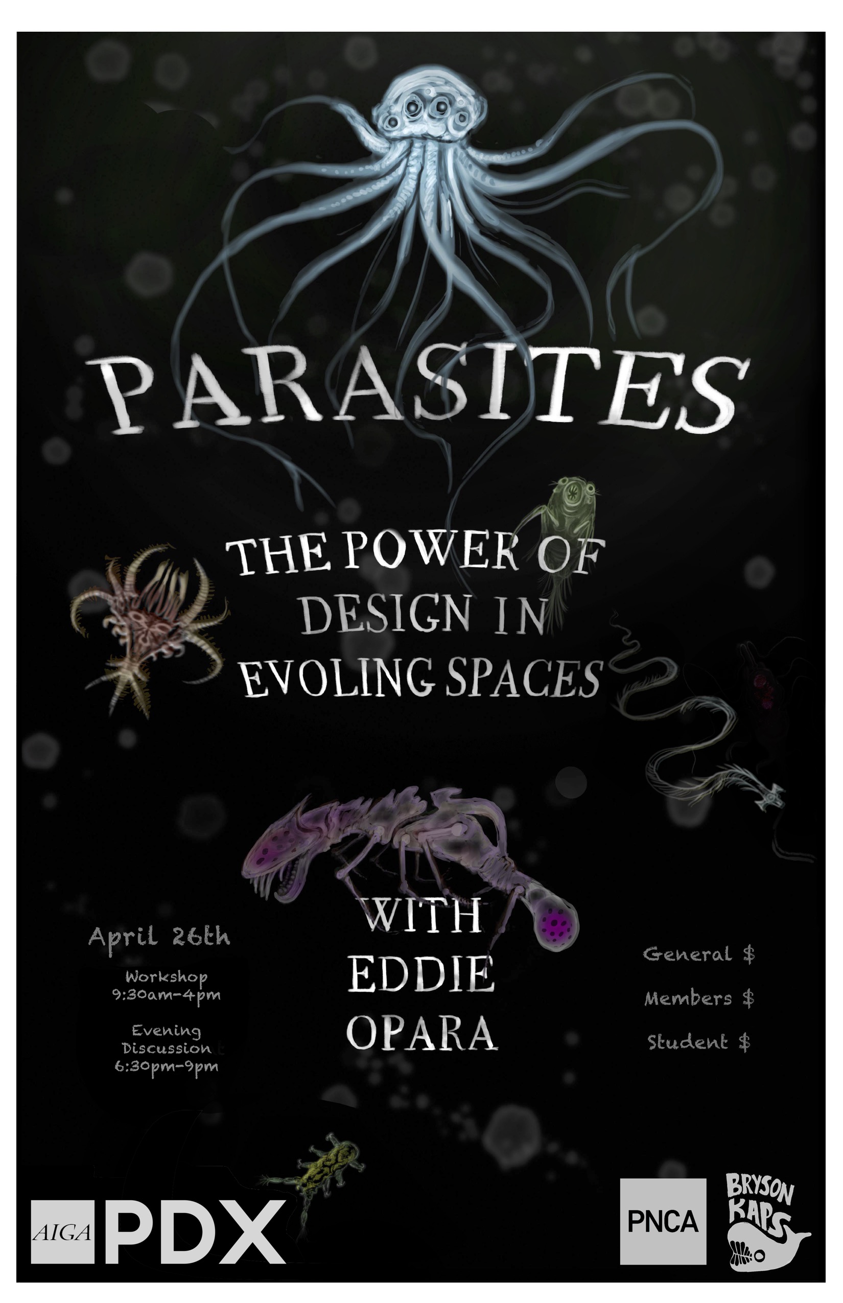
Bryson Kaps, student at PNCA
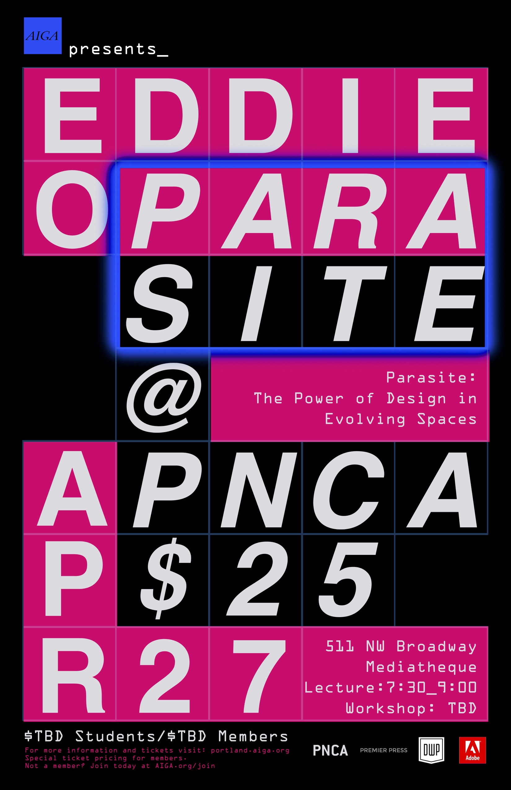
Jourdan Simmmonds, Student at PNCA
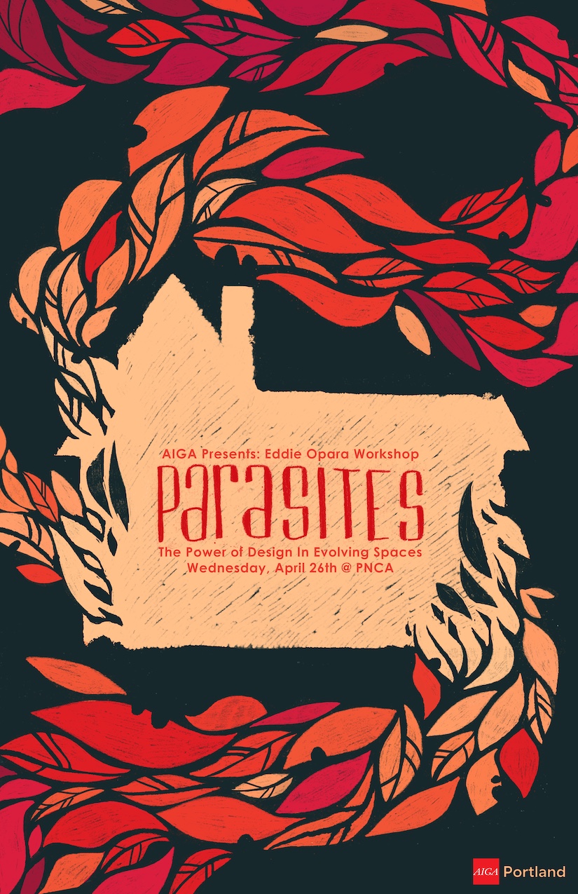
Grace Murphy, Illustration at PNCA
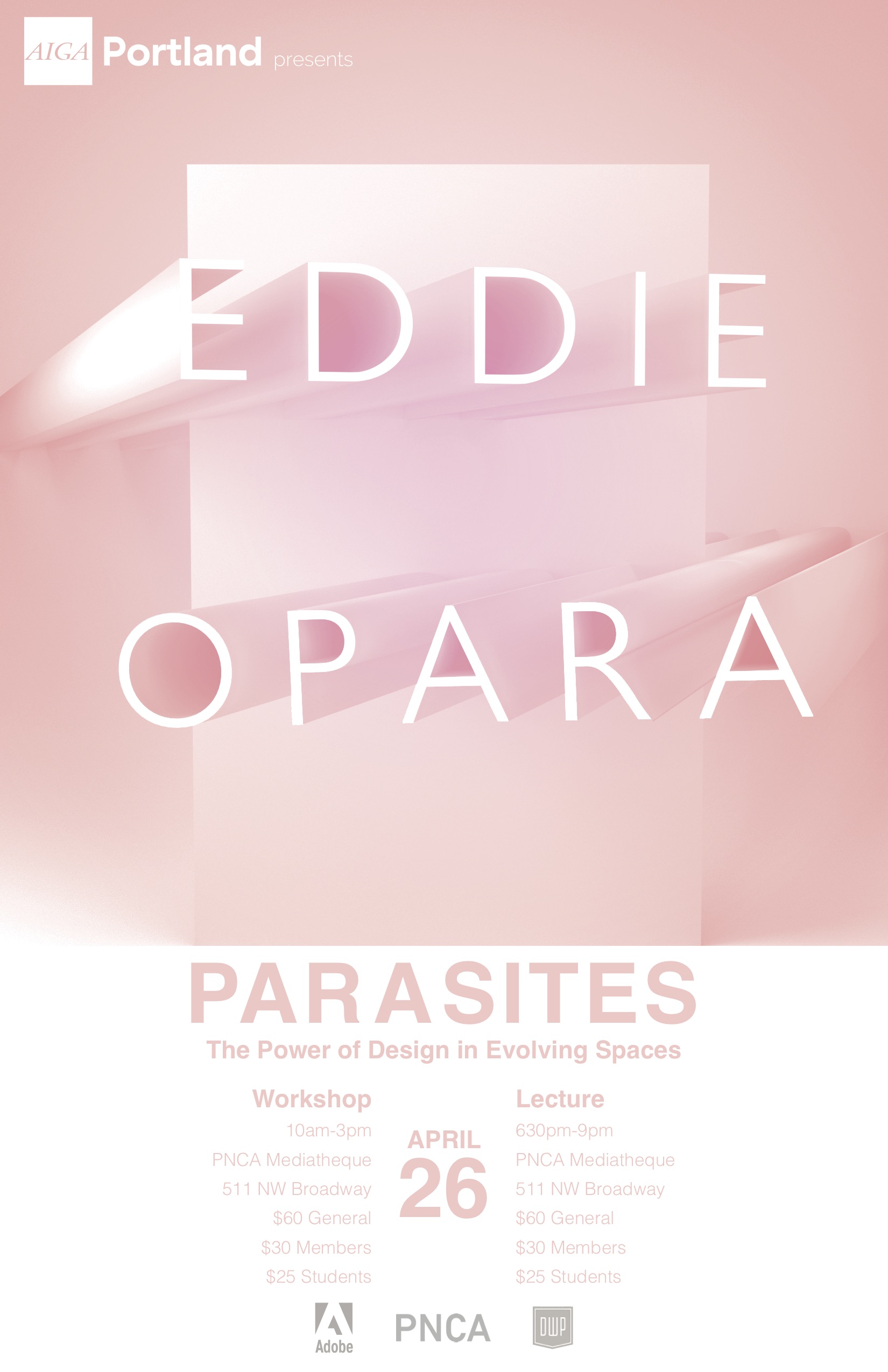
Alex Roebling, Design & Visual Communications at PNCA
“My process of interpreting an artist’s work is to research, and then simply take a step back and look at fundamentals. Look at the not-so-obvious formal qualities of an artist’s body of work. What abstract or basic elements can be shared between my work and theirs, and then give myself the freedom to work within my own familiar mediums and sensibilities of elements that aren’t as directly derived from the artist.”
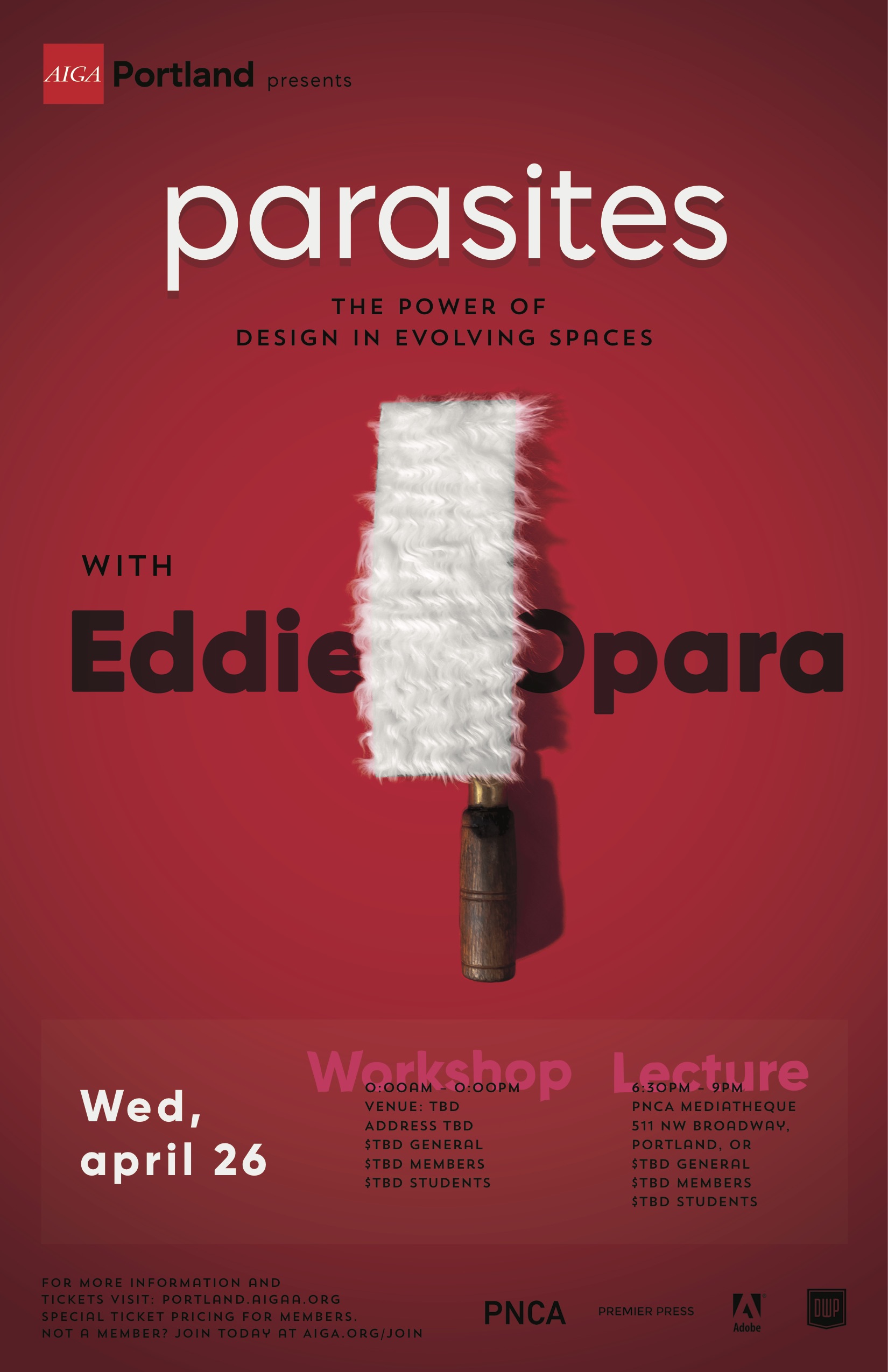
Mariah Currey, Communications Design at PNCA
For Currey, “a poster that stands out and quickly/easily explains what it represents is basic, and if it looks beautiful or tickles the brain in some way, then it’s memorable. Translated into other media, a design must be adjusted to still stand out, depending on the noise around it.”
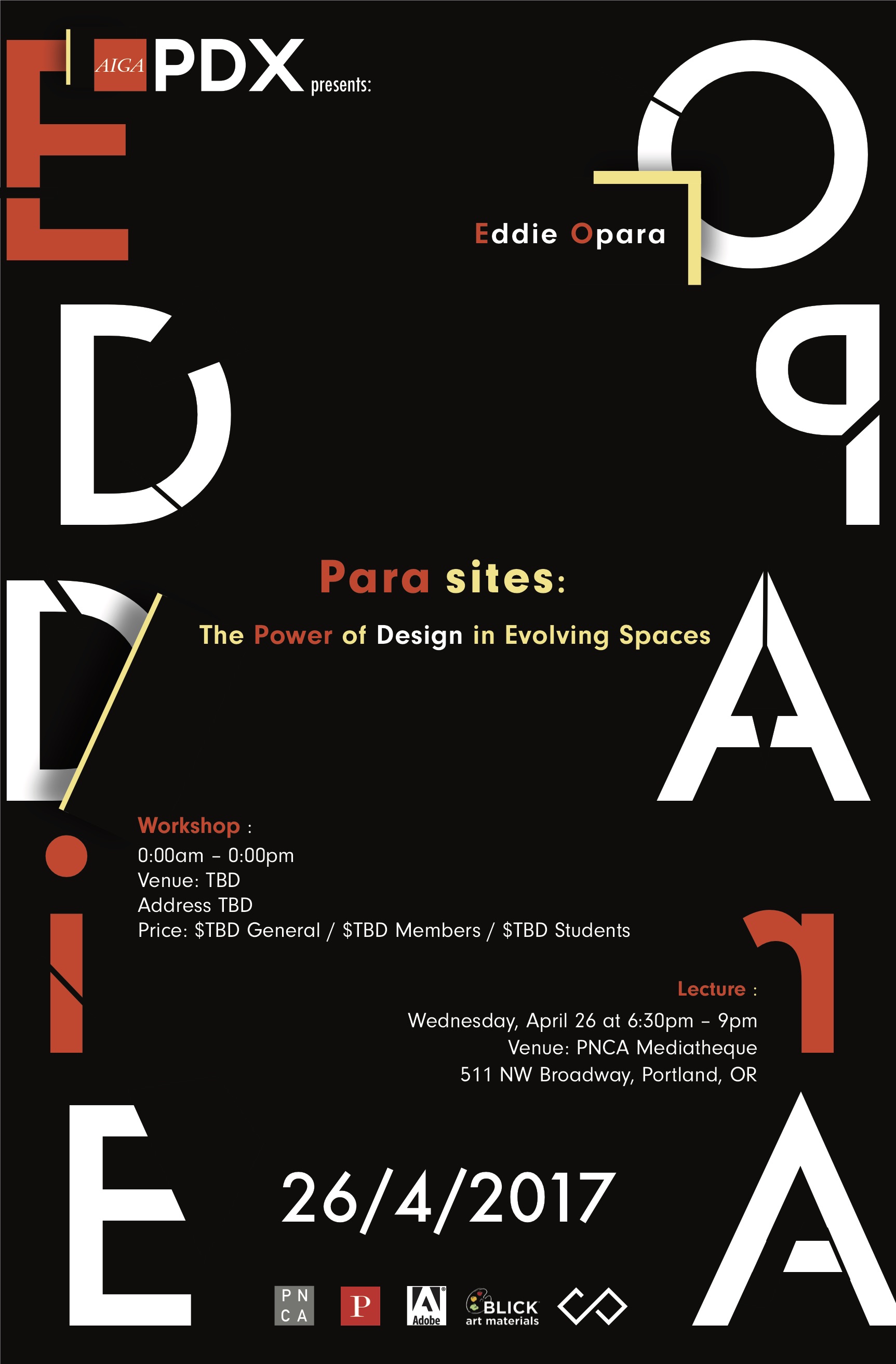
Corey Ondrey, Commmunication Design & Illustration at PNCA
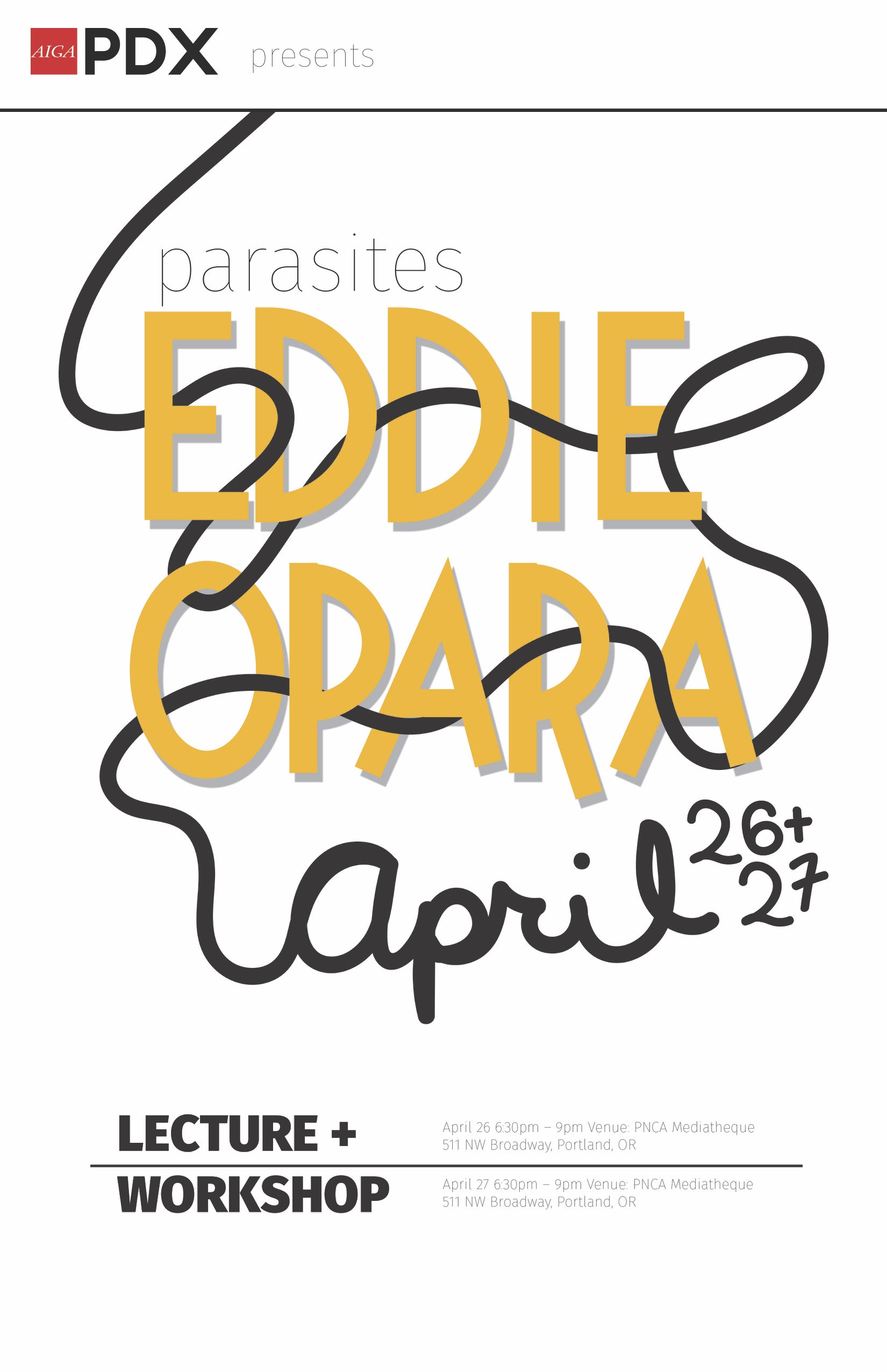
Kami Karras, Communication Design at PNCA
Karras brings the understanding that every viewer has a different perspective, therefore a poster won’t resonate with everyone. In order to create an effective design, you need to create something that catches the eye and causes a reaction of wonder and curiosity, a belief that there must be something unique and good within the design or what it represents.
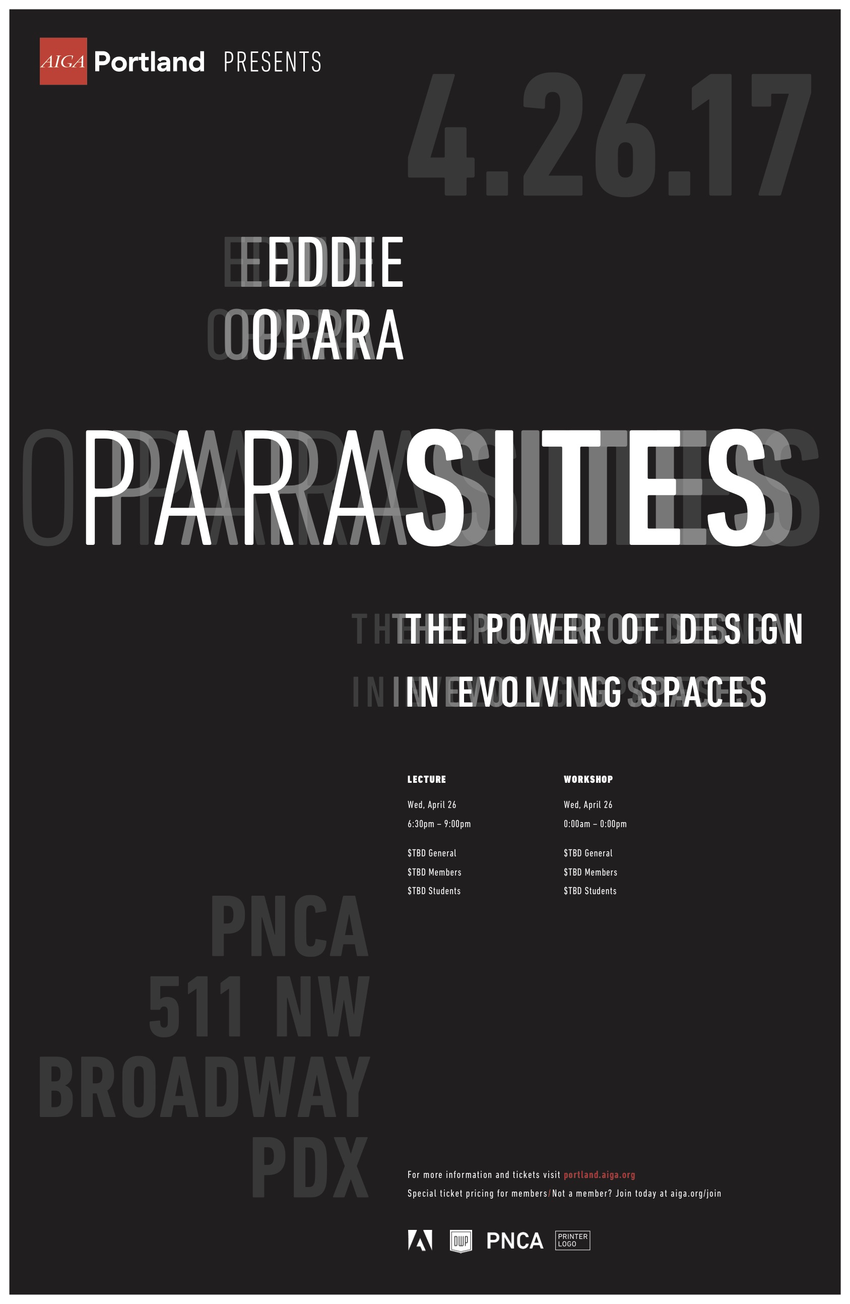
Kathryn Bailey, Communication Design at PNCA
“I usually need more than one brain to reach a great graphic direction….” Bailey believes that collaboration can help bring forward the best design possible, relying on multiple perspectives to understand the work’s impact.
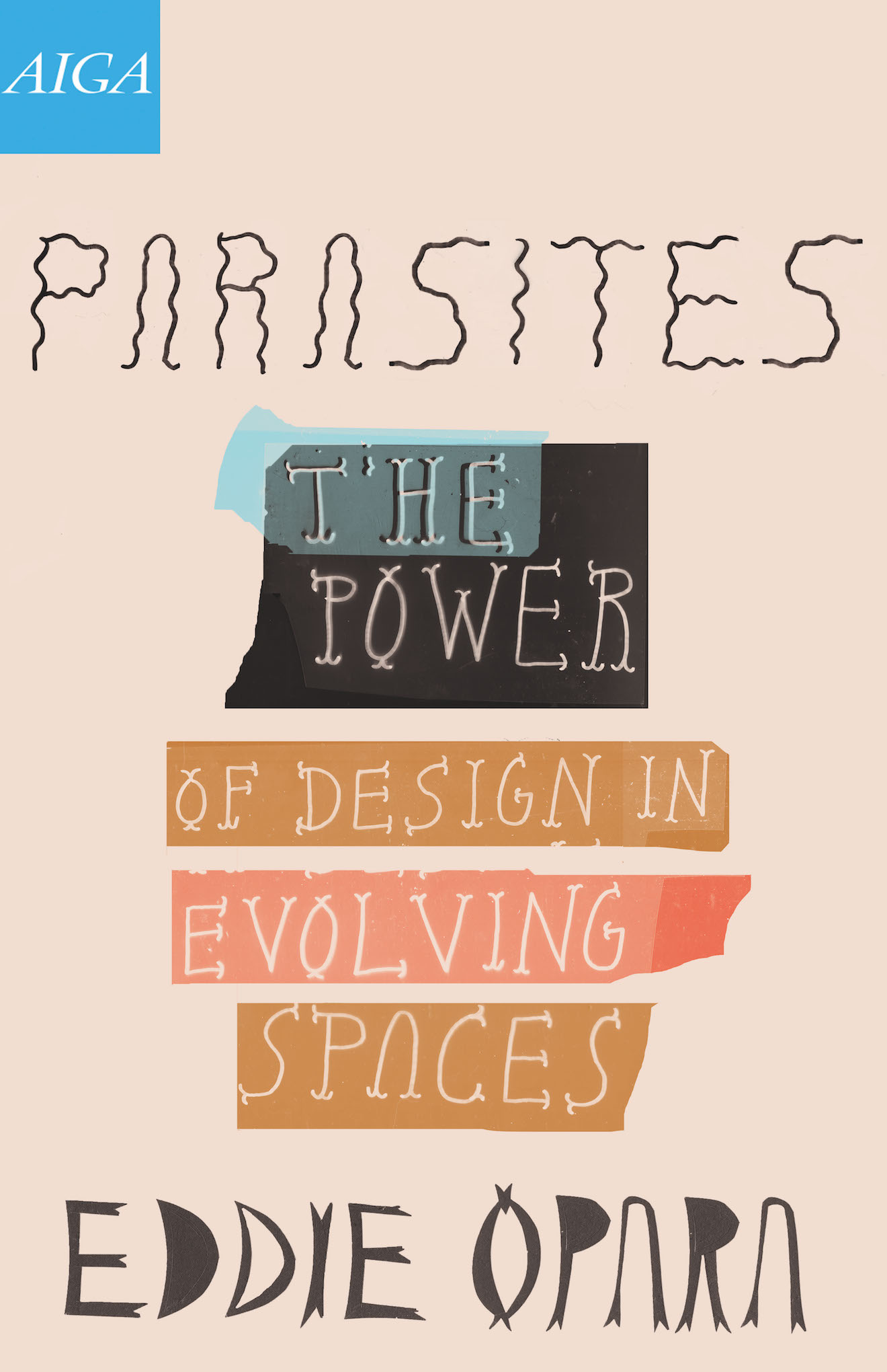
Samantha Sausser, student at PNCA
AIGA Portland’s Design Week Portland Events
Learn more about the two Design Week Portland events: