AIGA sat in on the “Presenting Work With Confidence” workshop led by Mike Monteiro recently and we share some of his wisdom below. Mike is the co-founder of Mule Design and conducts workshops frequently about the high art of design presentation. In this day long session, he taught a small pack of designers how to own a room and “put some church in it” to sell their ideas. Check for his next workshop dates here.
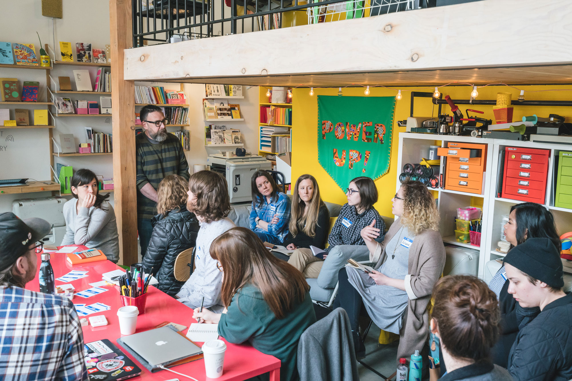
According to Mike, “The myth that good design sells itself is just that—a myth. Good solutions aren’t always obvious at first glance. Good ideas, even the best ideas, need to be sold. A designer who can do pretty good work and persuade the client it’s right is worth more than a designer who does amazing work but can’t sell it to a client. Creating a compelling story from a list of recommendations is an often overlooked design skill.”
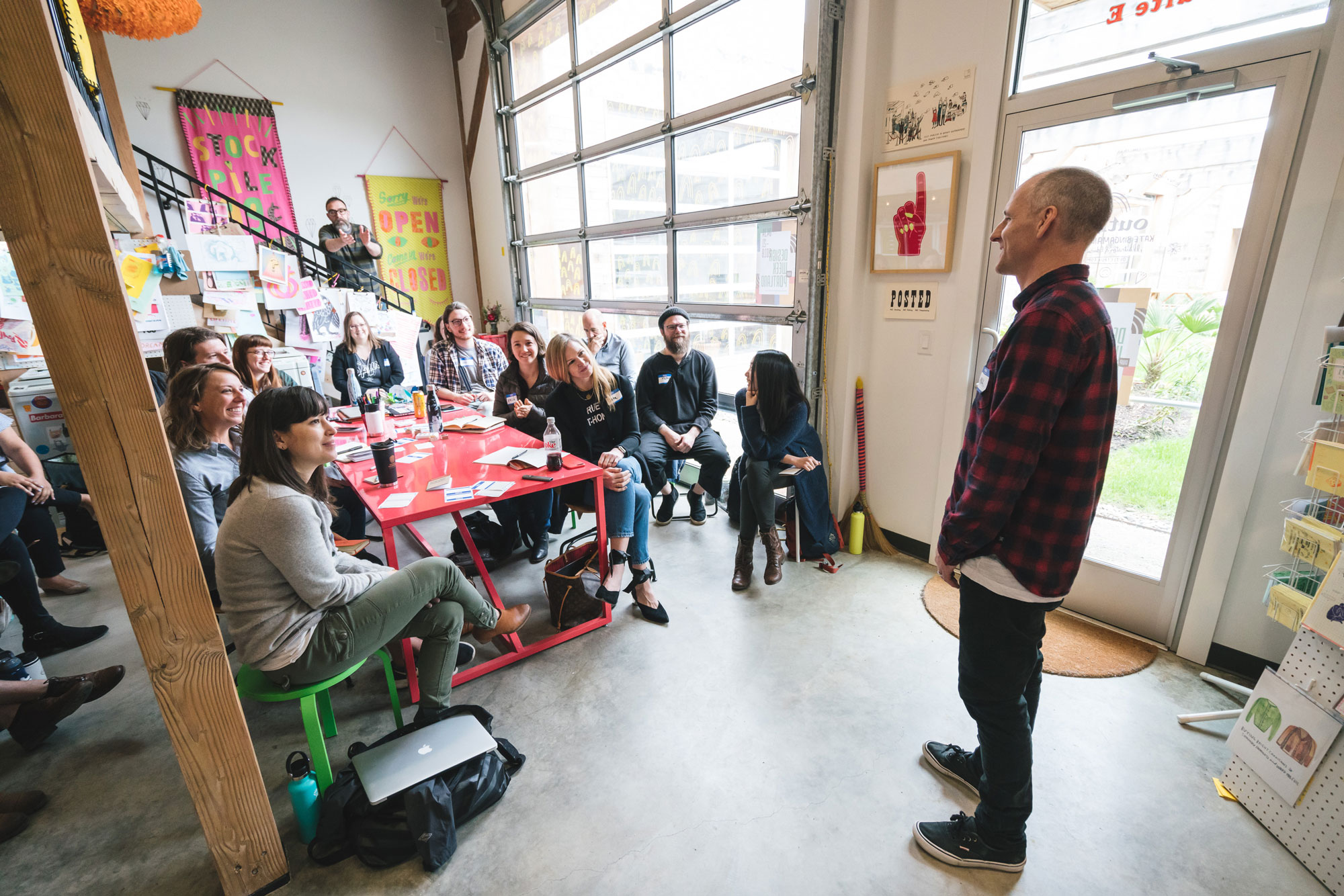
We soaked his wisdom in as he deftly coaxed presenters into winning over a room. He broke down his presentation advice with poetic ease, like it was a Six Gallery reading. We share his insights below—internalize them and then go get your most brilliant work approved this summer.
Mike shares his list of thirteen mistakes to avoid while presenting to clients:
-
-
-
Seeing the client as someone you have to please.
Your client hired you because you are the expert at what you do. They are the expert at the thing they do, and you have been brought in to add your expertise to the client’s expertise to help them accomplish their goal. What they didn’t hire you to do is make them happy or be their friend. Your decision should revolve around achieving that goal, not pleasing the client. And while you should do everything in a professional and pleasing manner, never conflate helping the client achieve their goal with making them happy.
They will ask you to do things that run counter—in your expertise—to achieve the goal. Your job is to convince them otherwise. In the end, they will be better served if you see yourself as the expert they believe they hired.
-
Not getting off your ass.
This is your room. Your first job is to inspire confidence. Not just confidence in your work, but also confidence in your client that they hired the right person. Every interaction is an opportunity to reaffirm their decision in hiring you- and you will seem more confident if you stand up and lead the meeting. Your voice will carry better. Be the authority on design your clients hired. Work the room. Walk to where you are needed. Being on your feet will allow you to walk from person to person as they ask questions, simultaneously making you look more confident and allowing for more intimacy.
It should go without saying that you dressed nicely and your hands are out of your pockets. Now run your presentation, sport.
-
Starting with an apology.
Do not start the presentation with an apology or a disclaimer.
No matter how much you had hoped to present, by the time you get in that room, whatever you have is exactly the right amount of work. Any resetting of expectations should have been handled before the meeting.
Obviously, don’t do anything that you will need to apologize for. Like showing up late. Or forgetting an adapter. Or spilling coffee on your new white shirt. And if you are really not prepared for the meeting, then better to cancel it than to waste your client’s time. You can get away with that exactly once during a project.
But by the time you are in that room, be ready to present strong and to exude confidence.
-
Not setting the stage properly.
You have gathered all of these busy people together. They probably have other things to do. So let them know why they are in this presentation. Let them know they are a necessary and important part of the conversation. People like feeling needed. And they hate having their time wasted.
Start the meeting by thanking them for their time. Let them know what their role will be. Why they’re here. What you will be showing them. And what kind of participation you need from them. This is your opportunity to make them feel like the experts they are. Let them know what stage of the project you’re in. Give a very brief reminder of what the last stage was, how it helped you get to this stage, and how the presentation you’re in now will help move the project forward.
-
-
-
-
Giving the real estate tour.
Never explain what they can obviously see right in front of them. They can all see the logo on the top left. They can all see the search box. There is absolutely nothing more boring than a designer walking a client down the page, listing all the things they can already see.
Pull up! You’re in the weeds! You don’t sell a house by talking about the sheetrock. You sell it by getting the buyer to picture themselves in the neighborhood.
Sell the benefits of the work. Sell how the work matches to the project’s goals. Sell how their new site is going to crush their competitors and make them all rich beyond their wildest dreams.
And while every decision on that page should have been made with the benefit of date and good research, people are irrational creatures who don’t make decisions based on data and research. They make them based on stories. So find your story and tell it.
-
Not assigning roles.
You’re too busy giving a presentation to take notes. You’re on stage. Ask someone else to take notes for you. And then post them for the client to review after the meeting so you can agree you heard the same thing.
-
Reading a script.
I’m already asleep.
You need to convince your client that you’re excited about what you’re showing them. Let’s be honest here. This is a show. There’s a little smoke and mirrors. There’s a little P.T. Barnum. Not so much that it’s a clown show, but enough that you’re building up some excitement. Work towards a crescendo. There’s a little difference between a designer presenting work and a DJ working a crowd. You are selling a design. So have your facts straight. Have your homework done. Know why you’ve made the choices you’ve made. Have notes nearby if you need to refer to them, but you shouldn’t be sitting near your notes anyway. (Remember you’re walking the room.) But work all of these around an exciting narrative. And practice it enough that you know it going in.
Be a scientist when you work, and a snake charmer when you present.
-
Getting defensive.
You are not your work and your work is not you. It is not an extension of you and it is not your personal expression. It is work product done to meet a client’s goals. The client is free to criticize that work and tell you whether they believe it has met those goals or not. You are free to disagree with them. And you are expected to be able to make a rational case for those disagreements. But you are not allowed to get butt hurt about it. This is a job.
There’s a difference between defending the work and getting defensive. The latter is personal; it happens when you’re seeing the criticism as a reflection of yourself. Guess what, sport? Good people do bad work sometimes.
So when the client starts critiquing the work, listen to what they are saying. Don’t feel like you have to defend all of your decisions then and there. You also don’t have to promise them anything then and there. Sometimes it’s best to sit on it for a while. It’s perfectly fine to say something like “That’s interesting feedback. Let me think about it.”
-
Mentioning typefaces.
Clients don’t give a shit about typefaces. And if they do, they’ll ask.
The thing I’ve heard most often from clients is “I don’t know anything about design.” (They’re wrong by the way.) This is their way of telling you they’re uncomfortable. They hate feeling uncomfortable, and you do too. It’s on you to get them back in their comfort zone, which is the thing they’re experts in—their business. Which is great, because that’s something you are not an expert in. It’s great to have one in the room. There’s already a design expert in the room–you!
So when presenting the work, talk about it in terms that relate to their business. Talk about how the decisions you made as the design expert match up to the goals of the project. Then your client can judge those as the subject matter expert they are.
But the color, the type, the design shit—you’ve got that. If you ask them for their opinion on design, don’t come crying to me when they give it to you, and you’re all like, “They don’t know anything about design!” They warned you!
-
-
-
-
Talking about how hard you worked.
The worst feedback you can get from a client is “Wow. It looks like you worked really hard on this!”
Stop using your work like a time card. If you did it right, it looks effortless. It looks like it’s always existed. And the client will probably be irritated that the paid you for 30 hours of work that looks like it took an hour. Which it did. They’re just not seeing the 29 hours of bad design that got you to that one hour of good design.
And for the love of God, please don’t show them those 29 hours of bad design. A presentation is a shitty place for a sausage-making demonstration and you’ll just come across as a defensive, unsure person needing validation.
Sell that one hour of good design–most people can’t do ten minutes of it.
-
Reacting to questions as change requests.
“Why is this green?”
“I can change it.”
I don’t really need to go any further into this one, do I? Just answer the questions asked. You should be able to answer that.
-
Not guiding the feedback loop.
There’s only one question worse than “What do you think?” (It’s coming up.)
Ever hear a designer scream about a client giving them the wrong type of feedback? I have. At which point I ask them if they told the client what kind of feedback they were looking for, and they just pull the panda hat over their head to hide their anger.
Most clients have absolutely no idea what kind of feedback you are looking for. And there’s no reason why they would. They don’t do this every day. They don’t have the training that you do. Nor do they need it, because guiding them toward the right kind of feedback is part of your job.
So during the presentation feel free to slap your hands together and say, “This is the kind of feedback I’m looking for today!” Here are some suggestions for guiding questions:
- How well does this reflect your brand?
- How well does this reflect your users’ needs as we discussed in the research?
- How well does this reflect your current ad strategy?
-
Asking “Do you like it?”
Dear sweet lord in heaven and all his angels, you just gave away the farm. They are no longer viewing you as an expert. You are no longer their equal in expertise. You are no longer the person they feel comfortable enough writing a check to. Even if they don’t realize it, all of these things just happened. You are now reduced down to a small child showing your dad a picture of the cat and hoping he deems it worthy enough to put on the fridge anchored by his magnetic Las Vegas bottle opener.

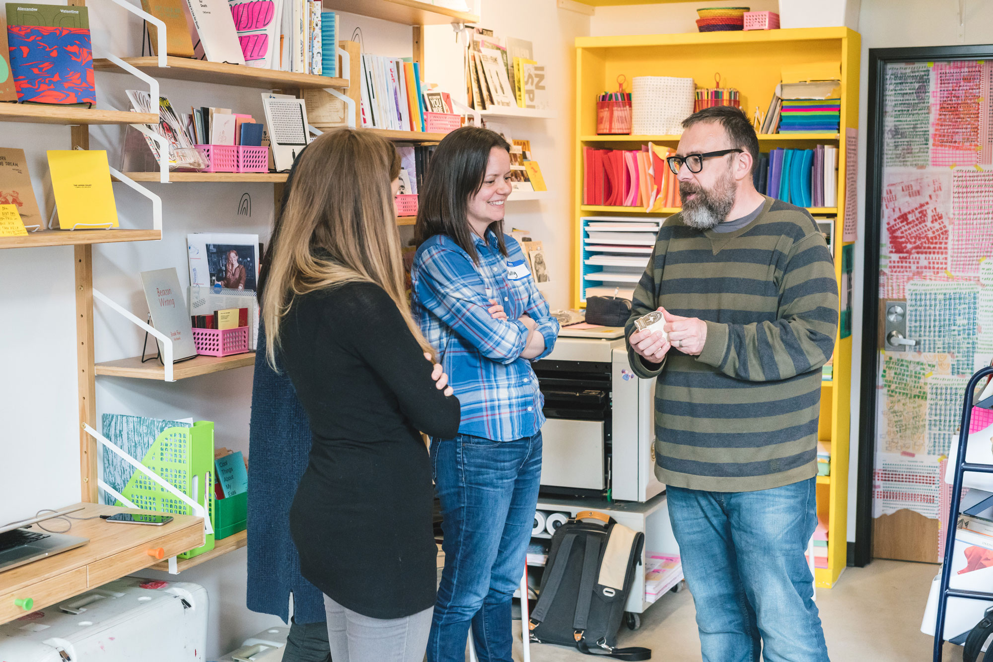
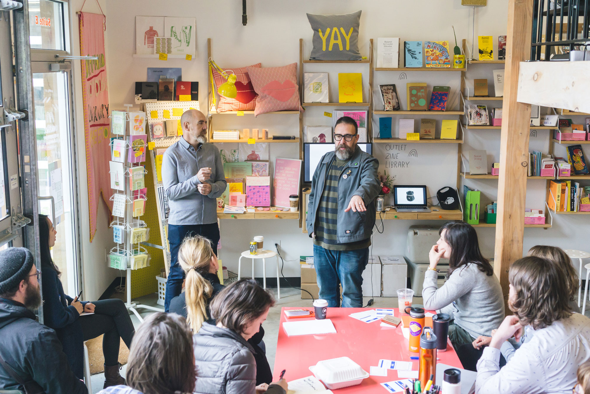
Thanks @mikemonteiro, @designweekpdx for helping designers tighten up their presentation chops! And special thanks to @outletpdx for hosting in such an inspiring space. And to @kudaphotography for the event images.

About Mule Design
Mule is a design shop specializing in strategy and training. Their goal is to design a better, more just world. They solve problems and help other designers learn the lessons they’ve learned over the years.
About Outlet
Outlet is the studio space of Kate Bingaman-Burt. The main floor is for workshops, pop-up events, and provides space for large projects. Outlet has open hours for workshop students to use their risograph machines, to browse the zine library or to visit their small shop. Check here for upcoming events in the space.
Outlet Hours and Location
2500 NE Sandy Boulevard
Studio E
Portland, Oregon, 97232
- Sunday 1-5
- Tuesday 5-8
- Wednesday 2-8
- Friday 1-6