On Wednesday April 26, at 9am in the thick of Design Week Portland 2017, a group of thirteen individuals gathered in the Bridge Lab at Pacific Northwest College of Art. They came from all walks of design-life, ages, and creative interests. They consisted of students, experience designers, illustrators, videographers, and graphic designers. For the proposition of hazard: they had no idea what was about to happen.
AIGA Portland invited multidisciplinary designer and Pentagram partner, Eddie Opara to run a Daytime Workshop and Evening Discussion. The two-part event was called Parasites: The power of design in evolving spaces. With our enigmatic descriptions and even more ambiguous challenges on social media, we together ventured into unknown territory only to be surprised, struck with awe, and highly impressed.
After a brief introduction and a banter of personal anecdotes by Content Director, Salvador Orara, Eddie kicked-off with an insight into his inspirations and outlined the framework of thinking for the day.
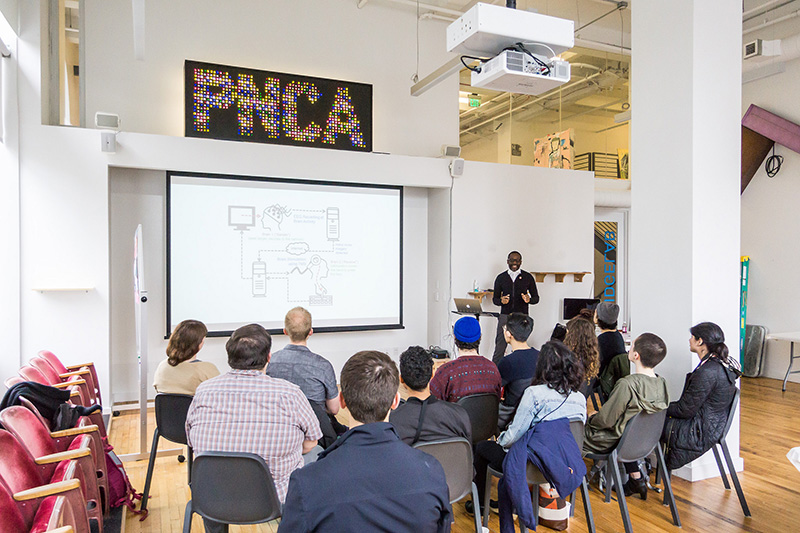
Conceptual Framework
The brief lecture covered key points and visual cues to inspire and motivate the workshop participants. Some of these included: advances in technology (which will enable new forms of media and communication), protests found in history, architecture, literature, and some of Eddie’s past work.
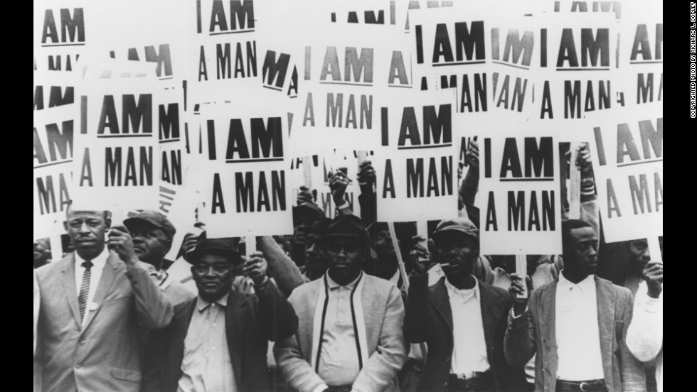
“I AM A MAN!” signs from the Civil Rights Movement at the Memphis sanitation strike in 1968.
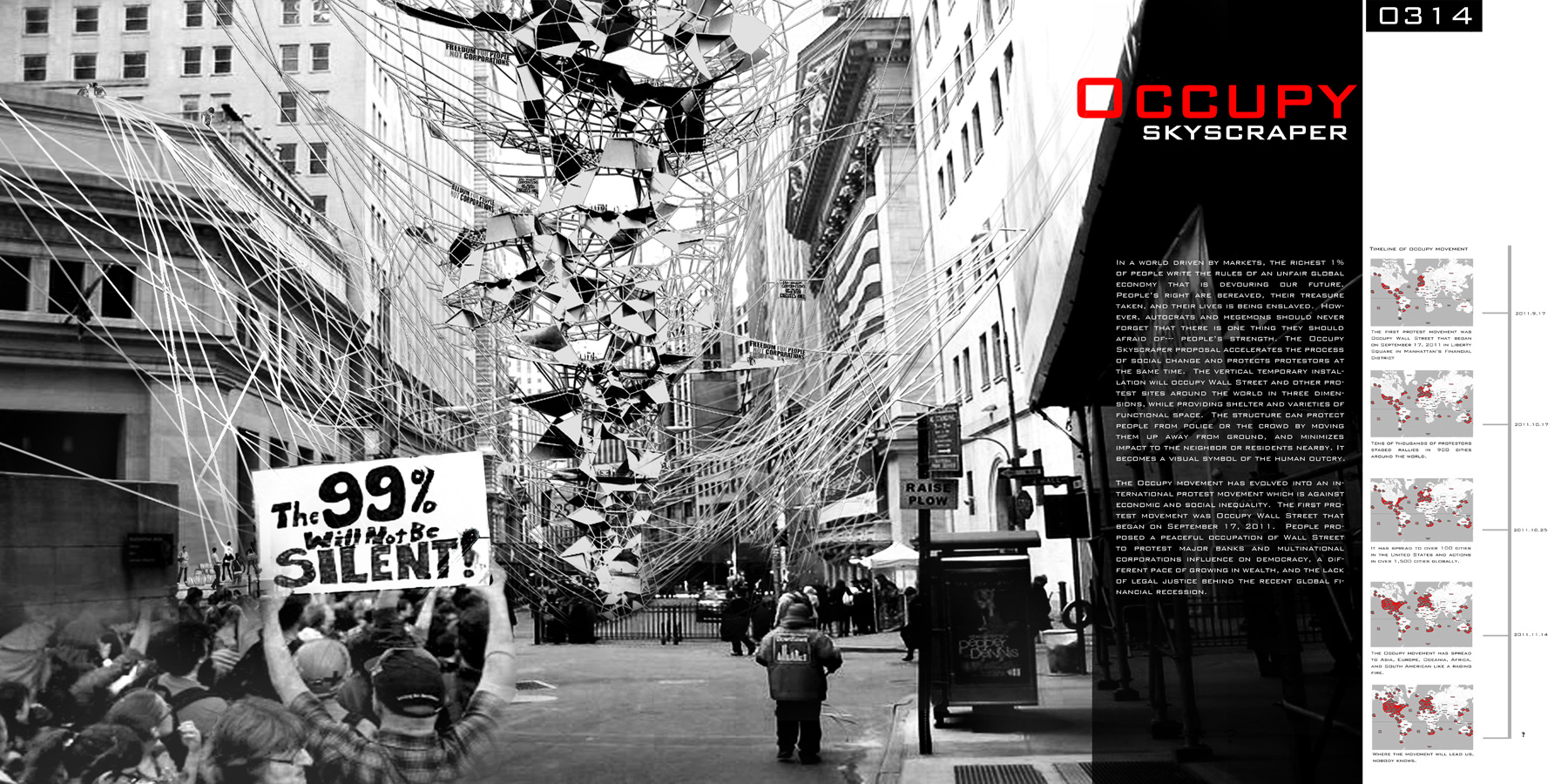
The Occupy Skyscraper — a temporary structure to be erected on any protest site intended to provide shelter and meeting spaces for dissenters.
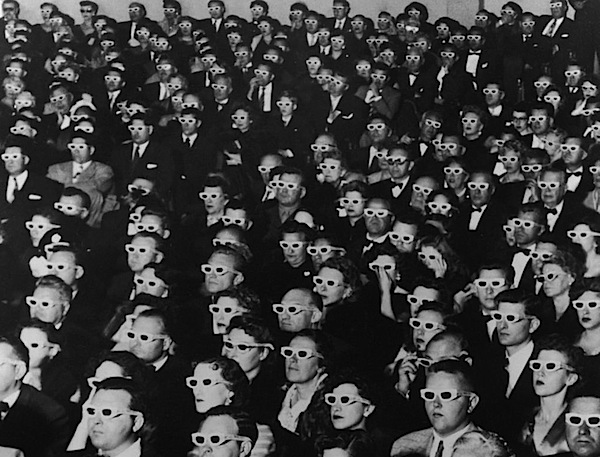
Society of the Spectacle — the work of philosophy and Marxist critical theory by Guy Debord in 1967 where he defines the concept of the Spectacle.
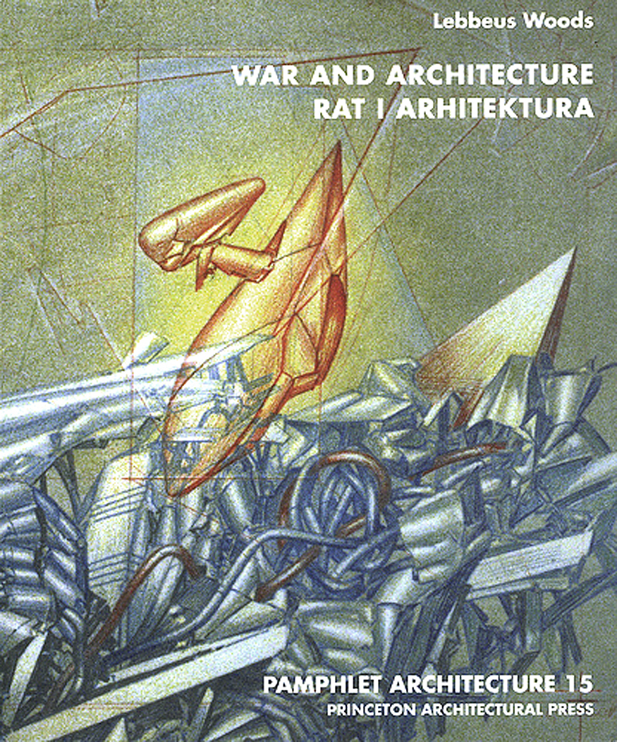
The work of Lebbeus Woods from War and Architecture which introduces the Third Principle: where the remains of what once was can be used to create something new.
The Brief
Eddie provides the design brief:
Design and build a physical or virtual parasitic model that applies a cause to protest or demonstration, that hacks through the commercial, social, and mass media landscape of today. Choose your parasitic site carefully, the contextual location is incredible important. It must protrude from architectural space (interior or exterior). Your message(s) should be direct and of a subject that you are passionate about, e.g., socioeconomic, sociopolitical, or sustainability issues.
Your graphical language must be bold and ready to start an insurrection. Your parasitic form needs to be dimensional. It cannot be flat, square, or polygonal. It must connote irregularity to an extreme.
With just under five hours of actual working time (some teams worked through lunch!), the room quickly formed into four groups of fairly mixed demographics. Each group was free to choose a specific area of the Bridge Lab to install their Protest Prototypes. Constraints were defined by the simple list of materials and specific design guidelines provided by Eddie:
- Paper
- Tape
- Pins
- Foam core (black and white)
- Blades
- Rulers
Design guidelines:
- No color
- Typographic
- Graphic marks
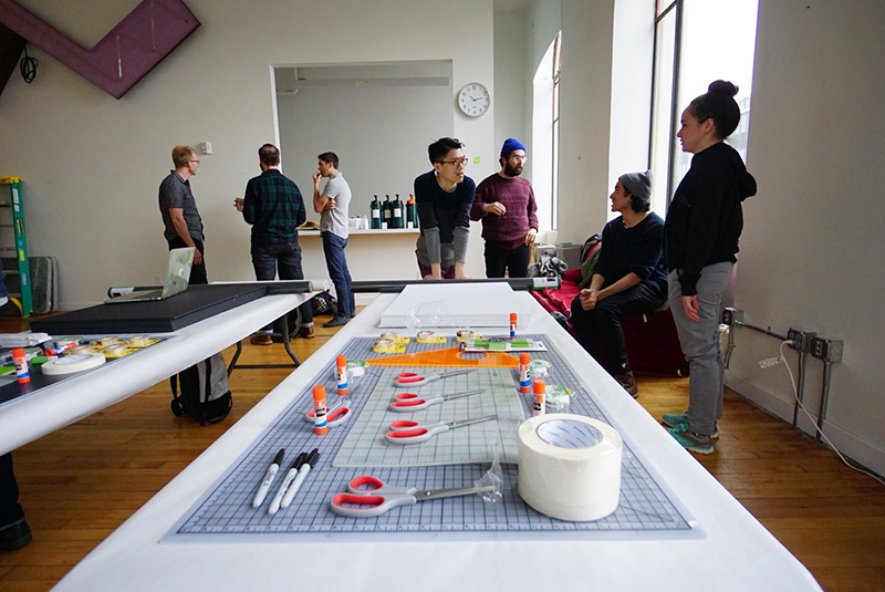
Ideation & Team Building
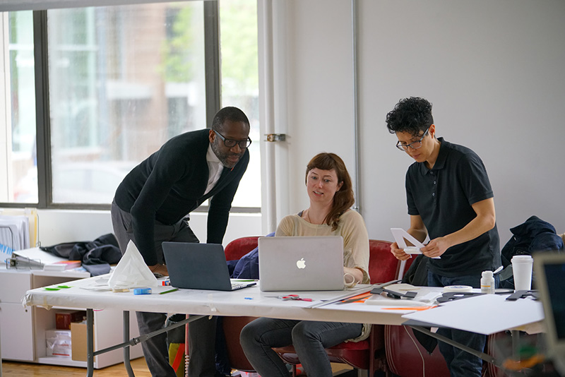
The challenge in making is starting. Most teams didn’t spend too much time discussing ideas. For the most part, the room quickly jumped into gear after a few cups of coffee. The workshop was both a creative challenge as much as it was a challenge of soft skills, collaborative techniques, and team-building.
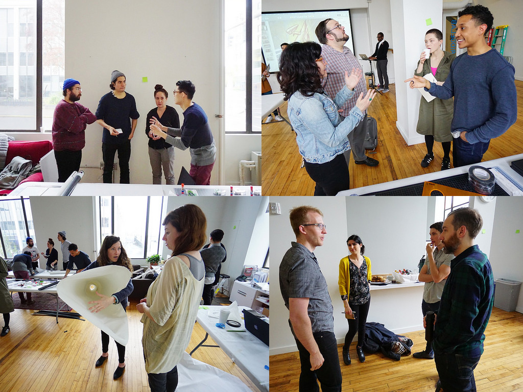
Making
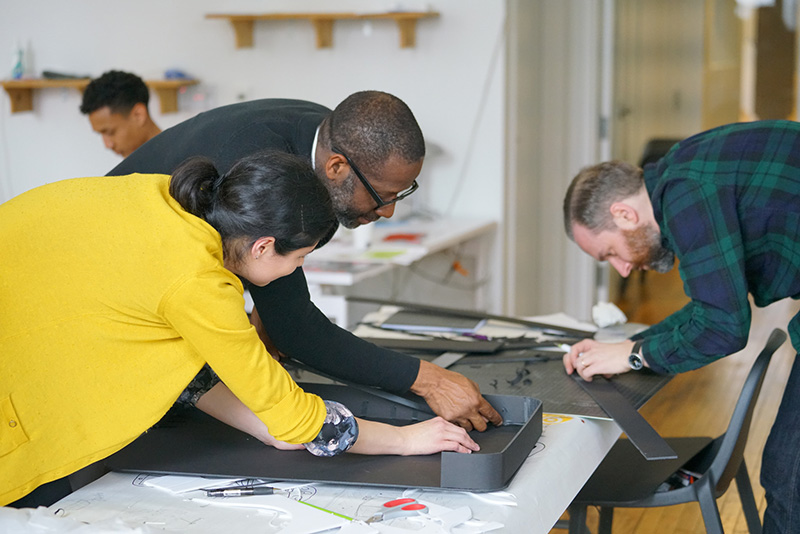
The driving ingredients of the day were energy and experimentation. Teams had time to dwell with their ideas, letting them stew. Some teams experimented with materials. Discovering how they behaved and understanding their grain. After the mid-point of the day, Eddie slowly made his rounds. Checking-in with each team to discuss their concepts and methods of making. He even jumped in at certain moments to lend a helping hand!

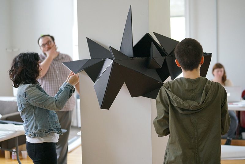
Outcomes
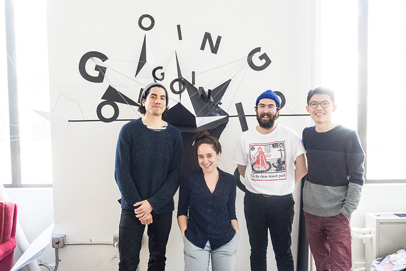
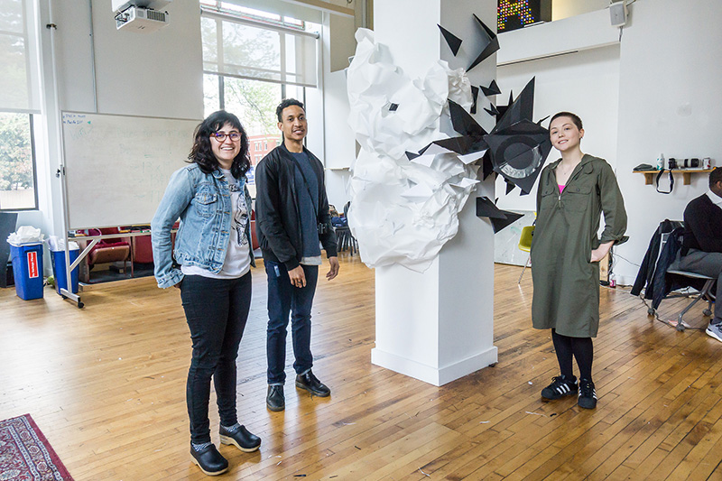
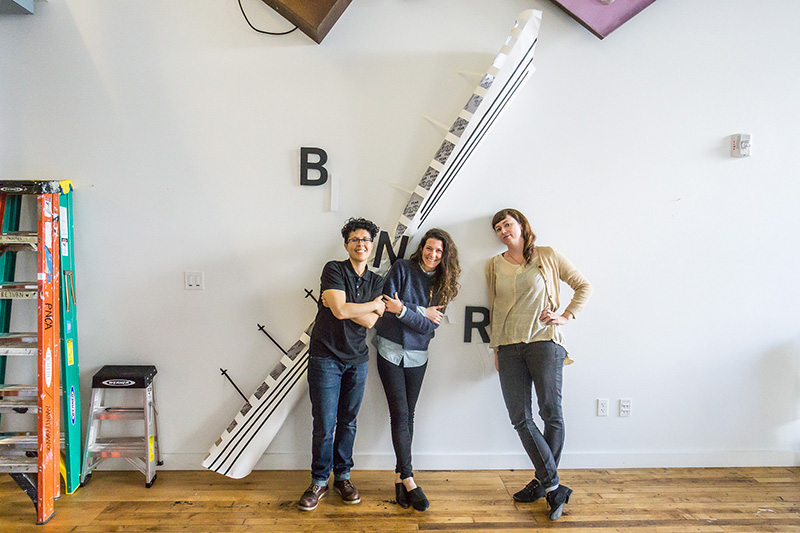
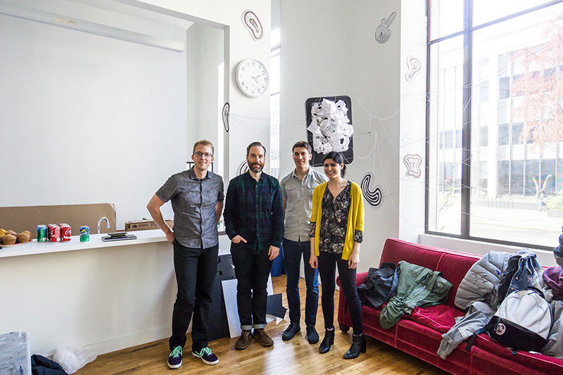
With predominantly “Untitled” pieces, most concepts dealt with some kind of duality — two forces opposing one another to create a single structure and message. This was most likely due in part to the color constraints of black and white materials. However, while the color constraints played well with the dualities, other concepts took the black and white to unique and interesting places. The messages varied from global warming, technology and fear, media and meaning, to social anxieties. Needless to say, Eddie was impressed and blown away, and so were we.

Participants
Here’s a big shout out to our Design Week 2017 Workshop Participants. We salute your effort, energy, and experimentation; and we hope you continue to challenge yourself to think outside of the box within your everyday design practices.
- Gaelan Andrade
- Damien Dawahare
- Stephanie Drachman
- Matthew Ford
- Alex Gregory
- Shelby Lynch
- Allie Scanno
- Marilee Sweeney
- Steven Xue
- Matthew Marosz
- Amber Offir
- Nico Filoseta
- Irene Ramirez
Workshop Photos by Darius Kuzmickas
Visit our Flickr Page for more Workshop photos!
Event Sponsors


